University of Northampton Research Conference June 2019

images showing university of northampton

I love a good conference!

Themes running through the Annual Research Conference were around research being creative, inclusive and applicable. It needs to make a difference to the lives of others, either within  communities aimed at supporting more effective research practice or ensuring impact in the wider society.

There were many examples of creative approaches to postgraduate research.

The ‘Bake your Research’ invitation resulted in some amazing creations. I missed the judging so by the time I arrived the cakes were under the first stages of attack.

results from the Bake your Research competition

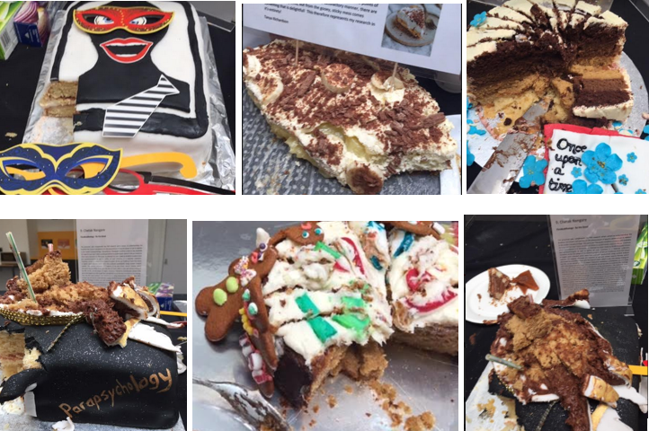
But, thanks to Twitter, the winning cake from Chetak Nangare has been digitised and uploaded to social media.

winner of the bake your research competition

Creativity was the theme of Julia Reeve’s keynote which addressed ‘Becoming a Creative Researcher‘ through the use of storytelliing, visualisations and Lego.

storytelling dice and activitiy instructions

I first encountered Lego through a workshop with Chrissi Nerantzi at MMU and the following year invited Chrissi to facilitate a session at Hull. This led to funding for bricks and the addition of model building to our programme of events supporting teaching, learning and research. Julia’s presentation reminded me of working with PhD students in the Graduate School where the opportunities to build and share their research models reinforced the power of stepping outside traditional academic boundaries and trying alternative approaches. The outputs can offer surprising insights and the technique is well worth trying.

image from twitter showing Kieran Fenby-Hulse

Speaking of alternative, Kieran Fenby-Hulse bought his unique ‘academic cabaret‘ to the conference. Titled ‘On Difference and the Academy‘ Kieran explored notions of privilege and outsider theory to question approaches to equality and diversity in higher education, and to challenge academia as being a conservative and exclusionary environment.  Original and provocative, Kieran disrupted traditional keynote expectations in ways which were both entertaining and hard hitting, through his talent for words and performance, alongside quick-fire changes of genre and clothes, all combining to make it an unforgettable event.

Postscript – Kieran’s keynote can now be seen on You Tube https://www.youtube.com/watch?v=29mqaIWoq1g

Images showing Kieran Fenby-Hulse performing his academic cabaret

Inclusion was a thread running through the presentations.

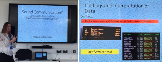
For me, the most memorable included Jay Batchelor who spoke about ‘Sound Communication? Language Preference for the Deaf Community‘, Introducing herself in sign language (reinforcing how l’ve have forgotten most of mine through lack of practice!) Joy addressed the need for inclusive approaches to communication. We often we take for granted the ability to participate in the built environment and Joy demonstrated this with a comparison of information text from a train station and an airport. I took away a useful reminder of how accessibility of content, often focused on vision impairment, needs to incorporate equal attention to hearing loss as well.

Joy Batchelor presneting on communication for hearing loss f

I also liked Lucy Atkinson’s work on student transition. It demonstrated how much transition support has developed since the Getting Started initiative at the University of Lincoln which I faciliated many years ago. This addressed the student experience in the months and weeks prior to enrolment but Lucy’s work is breaking new ground by researching and facilitating support at Level 3 through the Foundation Student Framework at UoN. Lucy also spoke about Urb@n Research at the University of Northampton, an undergraduate bursary opportunity similar to UROS at Lincoln.

Lucy Atkinson presenting on student transition

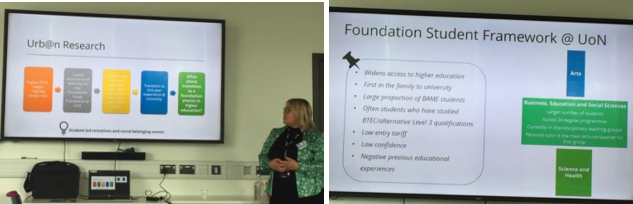
Lucy showed a great example of the use of social media on her concluding slide. So often at conferences, you want to follow up presentations and adding a slide like this makes it easy.

Lucy Atkinson contact information

Current developments with supporting researchers to get the most from their postgraduate experiences, and building a PGR community, was introduced by Melanie Petch, Research Developer in the Graduate School at UoN. As a distance learner, doctoral research can often feel like an isolating and exclusive environment. It was lovely to meet Melanie in person after having corresponded for so many months, and good to see how the Grad School is very much aware of the need to include all students, regardless of location and mode of study.

Melanie Petch presenting on reseatcher development

The issue of language was frequently raised, in particular the word ‘training‘ and its potentially negative influence when used to refer to research events. There are parallels here with digital practice where programmes of development are so often labelled as ‘training‘ sessions. I noticed in many groups there was still an association of digital practice with ICT and technology rather than pedagogy or learning design. Language matters and a huge advantage of research conferences is with providing places with time and space to discuss the appropriateness of the words we commonly use, often without considering their wider meanings and interpretations.

Student identity was another subject of debate relating to language.  As well as undergoing doctoral research, Anthony Stepniak is the Student Research Student Officer for Northampton Student Union. The presentation on the ‘Ethical implications of staff/student research‘ addressed ways in which student roles are understood and reinforced.

Are students partners, collaborators, co-constructors or paid assistants? Language choices influence attitudes which in turn alters approaches to student engagement and active participation in learning experiences. Blurred staff-student boundaries can create ethical gaps in partnership work which projects like this are highlighting in order to inform the necessary questions which need to be asked.

Anthony began his PhD the same time as I transferred to Northampton. We shared induction so are part of the same cohort and I’m intrigued by his research which looks at portrayals of the wicked queen in fairy tales. I remember discovering Bettelheim’s ‘Uses of Enchantment’ many years ago. I was fascinated to discover how myths, legends and folklore all contain elements of universal truths and am looking forward to reading more about Anthony’s work in the future.

It’s impossible to cover everything.

The universal conference challenge is one of choice.

Parallel sessions give more researchers chance to present but also mean audiences are split between the different strands. This was a conference with variety and vibrancy. I’ve missed the ‘Feminist Research Feminist Scholarship’ Roundtable which deserves a blog post of its own.

feminist research and scholarship round table

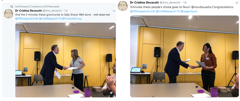
Ditto the ‘Three Minute Thesis’ where participants condensed years of work into 180 seconds.

winners of the three minute thesis competition

Oh – and ‘a phd is a thing of joy‘.

I’m still reflecting on the truth of that statement.

Another blog post in the making….

In the meantime the Waterside Campus was looking lovely in the summer sunshine.

images showing the waterside campus of the university of northampton

Final words in this post come from the presentation ‘Knowledge mobilisation in higher education’ by Hala Mansour and Cristina Devecchi. Evidence has to be applied in three ways; it needs to be exchanged, transferred and mobilised. Research is not just about producing knowledge. It’s about using and applying it.

cristina devecchi and hala mansour presenting

Research conferences remain valuable opportunities for the first step of mobilisation which is exchange. Every conference has a presentation which stays with you. Speaking from the experience of being there, Cristina also led the session addressing ‘Being a Refugee Child in Lebanon: Implementing Children’s Rights in a Digital World through the Blockchain Educational Passport‘.

cristina devecchi presenting

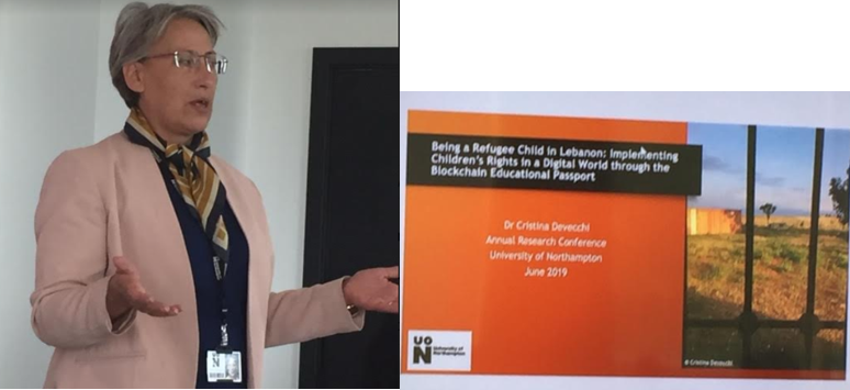
Displacement from home and country has led to the rise of mobile transient populations. Refugees leave with nothing except their minds. They have no possessions and in a world where digital identity is essential, they are digitally destitute. Cristina is reseraching the use of blockchain technology to make permanent records which can travel independently online and confirm educational achievement.

This issue is at the heart of shifts to digital societies. Those excluded are marginalised, silenced and made invisible. For refugees this is a digital divide on a scale which most of us with easy internet connections cannot even begin to understand.

This presentation exposed the millions living lives we can’t imagine. But as Cristina and Hala said previously, knowledge on its own is not enough. It needs mobilisation if its to have any real and lasting effect.

Events such as Northampton’s research conference can provide the first stepping stones to making this happen.


…..


The week the internet was 30

image showing Sir Tim Berners Lee
image from https://www.bbc.co.uk/news/technology-47524474

I’ve often wondered if what we call the internet keeps Sir Tim Berners Lee awake at night. Reading his open letter to the Web Foundation this week, it sounds like it might.

TBL writes ‘…the divide between those who are online and those who are not increases, making it all the more imperative to make the web available for everyone.’ and calls for us to ‘…make sure it is recognised as a human right and built for the public good….making this happen should be a ‘priority agenda of our governments’

image showing the earth surrounded by digital networks
image from https://pixabay.com/en/network-earth-block-chain-globe-3537401/

I would suggest higher education also has a role to play. The undergraduates of today are the citizens of the future, which will be digital in ways we don’t yet know or understand. They should be given opportunities to develop digital graduate attributes which not only develop confidence with online environments but include opportunities to raise awareness of the impact of digital practice. This should be critically examined and promoted in ways which are accessible and inclusive because the digital is political.

The internet is about power and all students should have time to explore questions about who holds this power and what is done with it to affect the lives of others.

social media icons on a tree
image from  https://pixabay.com/en/tree-structure-networks-internet-200795/

Walk down any high street, take public transport, sit in a pub or a café and its clear how connectivity rules. The mobile device is ubiquitous. Not 100% but enough to represent social transformation.  In less than two decades we’ve become digitally connected, with everything done online being tracked, recorded and monitored. Data about our online activity underpins all internet transactions. Online lives are exposed through browser histories with all transactions leaving permanent digital footprints. Bentham’s panoptican has been reinvented for a digital society. The all seeing eye is virtual.

Orwell and Foucault were right!

image showing the panopticon
image from http://foucault.info/doc/documents/disciplineandpunish/foucault-disciplineandpunish-panopticism-html

The early pioneers of the world wide web saw it as an opportunity to create democracy and give everyone a voice, in particular those previously silenced. While  evidence shows there are places where this has happened, the fact remains that patterns of internet access mirror existing forms of marginalisation.  Digital exclusion is a 21st century form of discrimination where those without equitable access are disempowered. But this is not the only problem society faces.

TBL identifies three sources of dysfunction affecting today’s web:

  • Deliberate, malicious intent, such as state-sponsored hacking and attacks, criminal behaviour, and online harassment.
  • System design that creates perverse incentives where user value is sacrificed, such as ad-based revenue models that commercially reward clickbait and the viral spread of
  • Unintended negative consequences of benevolent design, such as the outraged and polarised tone and quality of online discourse.

The Contract for the Web declares ‘governments, companies and citizens around the world can help protect the open web as a public good and a basic right for everyone.’ It calls for everyone to commit to a number of principles. Taking a few minutes to read and sign up is to make a commitment towards understanding what you do online matters.

google icon seen through a magnifying glass

image from https://pixabay.com/en/magnifying-glass-google-76520/

The contract is not only aimed at governments and corporations, there are individual responsibilities for citizens who can agree to the following.

  • Be creators and collaborators on the web so the web has rich and relevant content for everyone.
  • Build strong communities that respect civil discourse and human dignity so that everyone feels safe and welcome online.
  • Fight for the web so the web remains open and a global public resource for people everywhere, now and in the future.

For every advantage the internet offers, there are disadvantages. The internet is a mirror of society with all its benefits and horrors. If we want to make a positive difference, we can commit to ensuring our use of the internet prioritises those values which promote public good.

As internet users, we all have a responsibility to ensure not only equality of access but attention to the ways that access is used.

As the web reaches the age of 30, this week is an opportune time to raise discussion and debate about these issues. Visiting the Contract for the Web would be useful place to begin.

life ring against a stormy sea
image from https://pixabay.com/en/ocean-coast-spray-surge-2530692/

borrow my eyes

The Public Sector Bodies (Websites and Mobile Applications) Accessibility Regulations 2018 puts digital inclusion in the spotlight. It’s waving the diversity flag, calling for greater attention to digitally inclusive practice.

For a number of years I’ve had an eye condition called Uveitis. It’s treated with steroid drops and

  sometimes

injections

          in the eye

I see the needle coming!

The pupil is dilated, letting in too much light and blurring my vision.  It’s a first-class experience of sight impairment.

For several years, I helped people with sight loss to use the internet. Before that I set up DITTO (Disabled Information Technology Training Opportunities) at Centre 88, in Hull. Experiences like these showed how inclusive practices are essential for digital equality.

Inclusion matters, not just to function in a digital society but to maintain independent living, one of those things where – as Joni Mitchell sang – you don’t know what you’ve got till it’s gone.

Borrow my eyes

Share the fog.

image showing text with different sight loss conditions
image source was Skills for Access which is no longer available

Font, size, colour and contrast make all the difference.

Before anyone shouts browser controls, let’s be clear from the start, they’re no guaranteed solution. You could even say they’re abjuration of responsibility, peddled by those with high digital skills and low experience of discrimination.

Browser controls need users to be digitally literate and read small print. Even more importantly, to work effectively they require content to be accessibly designed in the first place. So before I get dismissed yet again for saying browser controls are not the answer – hear me out.

Please.

Many of those with vision impairment are unable to read the browser menus.

These are often unresponsive to zoom (see examples further down) and not everyone with sight loss uses a screen reader which accesses content ‘hidden’ in the html.

Assumptions are dangerous.

It’s a perfect storm.

Examples…

Text unresponsive to resizing line length I often work with high magnification so it’s really frustrating when enlarged body text size on websites doesn’t wrap around the screen.  If I have to scroll horizontally to find the end of the line I soon give up. Also, scroll bars themselves don’t magnify – their colour merges rather than stands out – and the largest size mouse pointer isn’t large enough. All this makes scrolling difficult. I need text to be responsive.

The image below shows a typical text heavy content.

Image One – typical page  

imges showing text on the screen

Image Two shows the text has magnified perfectly because the designer has chosen a responsive layout option. The ‘Word Art;’ appearance of the title text is best avoided. Tired eyes struggle with shadow and 3D effects. I’ve also changed the colour contrast using a Chrome app. .

Note how the text in the Chrome Contrast App menu remains too small to read.

Image Two – differential text size  

image shows high contrast menu is fixed with regard to text and colour

Associated with this is the issue of printing.

Many web pages send content to print using font size which is 10 pt or less. It’s too small!

This can be fixed at the design stage by creating a print version.. Better still would be a user control option whereby I can state my preferred text print size. Is this possible? I don’t know but it would be helpful if Chrome. Microsoft or Apple took this on as standard practice.

WordPress have a plugin whereby blog pages convert to readable font for printing. If you use WordPress please add this BUT the free WordPress option – like this Digital Academic blog – doesn’t allow plugins. It’s so frustrating.

The images below show another example of menu text which does not resize. this time it’s Windows.

Come on Microsoft. It’s such an obvious issue.

Image Three – default windows display colours 

default windows display colours

Image Four below  is using Windows ‘High Contrast #1’ option. Image Three above is the Default Display with no contrast added.  Compare the Header/Title Bar and Footer/Taskbars. 

For me, the High Contrast #1 option is more difficult to see. It’s unclear how Image Four can be considered an improvement on the default settings shown in Image Three.

Image Four – high Contrast Windows display options

The version of Windows I’m using offers four high contrast display options. Image Five below shows an option while Image Six shows the Google search page and WordPress Dashboard are resistant to these styles.

Image Five – high Contrast Windows theme

Windows High Contrast colors theme

Image Six – High Contrast theme with Google and WordPress

Where the contrasts appear to work (Office  programmes like Word) the effects are local so a PowerPoint prepared using a High Contrast theme will lose all its colours when opened elsewhere. There should be ways round this but how many people are digitally literate enough to work it out?

i haven’t gone into the issue of digital skills and capabilities in this post but it needs saying – to create and access digitally inclusive content requires a digital literate practice. Where do people go to learn this?

Other sources of frustration…

Using the Tooltips option to give additional information can be useful, in particular for screen readers, but I don’t use one and because the font size doesn’t respond to magnification,  I can’t read Tooltips text.

Image Seven – tooltips text 

Too often, accessibility tools are tokenistic rather than realistic.

Windows offers a magnifer but have you tried using it?

It’s mouse controlled (which comes with its own accessibility issues). It’s annoyingly jumpy and the text pixellates on high zoom (see Image Eight below). This is something Microsoft really could and should have sorted.

Image Eight – text pixellates with the Windows magnifier  

Differential magnification has been referred to with regard to menu text. It’s also an issue with programmes, for example Outlook (Image Nine) and NVivo (Image Ten) where only text in the ‘working’ window is resizable.

Image Nine – Outlook  

I’m currently using NVivo for thematic data analysis. It’s a powerful programme but doesn’t support increasing text size anywhere other than the reading pane.

Image Ten – NVivo 

image showing text size in NVivo

The same applies to Webinars (Connect, Collaborate etc) where the chat window doesn’t support increasing font size and these are only a few examples!

Image Eleven  below shows a gmail message magnified to a size I can read BUT the left menu column expands with the right. I can’t reduce it, fix it or close it – even though I don’t need it. What I find is the enlarged reading pane has no scroll bars for moving up and down or across. Why not? For all scroll bars tend to be too small with poor colour contrast, not having them at all renders the page inaccessible.

Image Eleven – gmail  

imge showing gmial on high zoom with no scroll bars

While on the topic of Google, Image Twelve below is from my laptop. Google have one of those annoying header banners which resizes along with the text. As a result it takes up 50% of the screen, defeating the value of increasing the text size of the content.

Image Twelve – google header size  

image showing google header banner

Have I mentioned the scroll bars!

In early versions of Windows there was a customised option whereby you could select individual features like scroll bars and buttons and change their appearance. I haven’t seen that for years. Why aren’t commercial giants like Microsoft and Google doing more to offer practical, day-to-day customisation options.

Put the term ‘browser controls’ into Google and you’ll get a host of links about parental controls – any immediate association with accessibility is missing from the algorithm.

Following standard advice, I search for help. The suggestion is to install accessibility extensions (See Image thirteen below)

How many people know what these are? The instruction highlighted in blue in Image Thirteen below is not helpful – how do you know what extension you want? It comes back to the point I started with. Most users know what they need to know to do what they need to do. The language of accessibility is unfamiliar.

Image Thirteen – accessibility extensions 

Chrome instructions for finding accessibility extensions The full list of extensions can be seen here Take a look…are the titles meaningful for you? I can guess what a Color Contrast Analyzer is but the Chrome Automaton Inspector? More intuitive language would be helpful.

These days a thin grey font on a white background seems to be the fashion but the poor contrast between foreground and background means I struggle to read it. The same for text over images and content which is fully or centre justified. When your eyes are tired, text needs to be easy to read. Left justification takes one click to do and makes all the difference.

A final grumble…(for now!)

For years I’ve relied on the keys Ctr+ and Ctrl- to adjust the size of digital text and images. Quick, easy and free, I prefer it to the zoom controls because it gives me control over text size which seems fundamental in terms of access. Lately I’ve noticed a new practice creeping in. Ctrl+ scrolls down the page instead of zooming in. WHY?

magnifying glass

Why is always a good question.

Why does digital exclusion matter?

Why isn’t accessibility the start and end point for all digital design courses, programmes and modules – teaching and training – policy and practice?

Why the invisibility?

lack of status?

A topic the next blog post maybe…

postscript

I’ve been asked to include scanning text documents and sending them as pdf – this creates an image which can’t be read by any text to speech software and cant be enlarged without losing clarity.

Also – please – no text over images. The example below uses capital letters (which research shows takes longer to read and understand). The best practice is to put the text in a block of colour instead.

image showing ways to layout text on images

Check all content resizes on zoom – I still see examples which are unresponsive where text overlays other text on high magnification. Ctrl+ and Ctrl- is a quick way to zoom in and out.

contet showing text overlying text


digital blindness and rethinking Maslow’s Hierarchy through a digital lens

hand holding a mobile phone
image from http://ddnews.gov.in/health/blue-light-smartphones-may-speed-blindness

Digital blindness is increasingly common.

The medical risks are growing but blindness to digital theory and practice are also a concern.

Too often the creators and shapers of our online lives assume the prerequisite digital literacies are in place but assumptions are not enough. Sit in any social learning space for an hour and it becomes clear how many are unable to maximise a screen or name and save a file. Anyone supporting learnng and teaching will have similar stories to tell.

Higher education appears blind to the need for developing individual digital literacies and confidence.

Why is this?

For centuries, universities have been about knowledge acquisition. Students as buckets. Turn on the knowledge tap. Fill them up. A consequence is approaches to digital accessibility have tended to follow similar transmission models. The reality is simply putting information out there isn’t enough to change hearts and minds.

Check out the OU Innovating Pedagogies series and the NMC Horizon reports then ask yourself where do staff go to learn to be so digitally confident?

drawing of a seesaw with a cartoon grey brain and red heart
image from https://pixabay.com/en/brain-head-psychology-closed-mind-2146159/https://pixabay.com/en/brain-head-psychology-closed-mind-2146159/

The 21st century has seen a massive shift from teacher-teaching to student-learning, but places, people and practice remain unchanged. Students arrive expecting to be lectured, PowerPoint slides are overloaded. Delivery speeds up towards the end to fit everything in. We’ve all done it. It’s easier to use tried and tested methods than step into new territory.

When it comes to the digital agenda, the map is still being drawn. We need to rethink and repurpose.

Children become literate from an early age. They learn from schools and families but when it comes to digital literacies, which are arguably more broader and complex than ‘read and write’,  adults adopt DIY approaches. In higher education digital literacies exist on multiple levels. Core keyboard and screen literacies, the use of mobile devices and app culture, cloud computing, digital pedagogies and the digital fingerprints belonging to individual subject disciplines. Everything has a digital dimension.

All the elements of Maslow have digital equivalents.

repurposed Mslow Hierarchy of Needs Pyramid
repurposed image original from https://commons.wikimedia.org/wiki/File:Maslow%27s_hierarchy_of_needs.svg 

A digital hierarchy begins with connectivity. Who hasn’t felt panic when realising your mobile phone’s at home or there’s no wifi in the remote cottage you’ve booked for a week.

Digital data has become our dominant currency.  Everything done online creates data footprints. Citizens need to work and function effectively in digital environments. Government and NHS have shifted to Digital-first while higher education is dependent on digital administration and virtual learning environments. The data this produces is increasingly being used to inform policy ad practice.

Relationships are developed, maintained, enhanced and ended through social media and apps for communication, collaboration and file sharing.  Our online practice creates digital presence. Whether these digital images are true or false the evidence suggest the ways we perform identity online are integral to mental wealth and wellbeing.

At the top of Maslow’s Hierarchy is Self-Actualization; becoming the best possible version of ourselves and realising potential. This is about self-fulfillment, which relates to the images we present. I’d suggest solely analogue means are no longer sufficient for living, learning and working in the digital age.

selection of digital tools and devices
image from https://pixabay.com/en/laptop-technology-computer-business-3244483/

I’ve been in higher education since the turn of the century and watched society become more and more dependent on digital literacies. Blindness to this is both metaphor and physical reality.

Digital is a massive agenda and by refusing to address it from universal, joined up perspectives, the sector has failed its staff across the board.

As a consequence, universities are failing students.

My concern is that digital blindness is infectious.

Becoming digital is an issue for higher education on so many levels. Teaching and learning, administration, employability and internationalisation while inclusive and accessible practice are essential elements for quality assurance via programme approval and validation  – the list could go on and on…

There’s a scattering of diverse groups and practices addressing digital inclusion, all excellent in their own way but too often isolated from each other.

While writing this I’ve been listening to the Jisc Webinar on the EU Accessibility Directive. https://www.jisc.ac.uk/training/new-regulations-new-risks-online-briefing

Details can be found in this blog post asking how much real difference the regulations will make.

It was affirming to see so many people on the Jisc webinar who care about creating accessible digital futures. I pledged to complete a post called ‘Borrow my Eyes’ which is about my own experiences with inaccessible online content.

Watch this space – it will be following soon…

mobile phone against a background of digitla faces
image from https://pixabay.com/en/smartphone-hand-photomontage-faces-1445489/


Designing for Diverse Learners

Image showng the University of Hull Venn Building with students in the forefront

The LTE Summer Programme (June 2018) included two days of LTE workshops where colleague Lee Fallin and myself took the opportunity to ‘launch’ an Introduction to Inclusive Approaches to Teaching and Learning, with specific reference to digital resources. This post offers an introduction to inclusivity with online content for anyone unable to be there.* 

The Home Office has an excellent poster series to highlight practices for developing content for users falling into one of the following six categories:

  • low vision,
  • Deaf and hard of hearing
  • Dyslexia,
  • motor disabilities,
  • users on the autistic spectrum,
  • users of screen readers (visual issues/blindness).

We we really impressed by these posters, but also overwhelmed with how we can support educators to use them in practice. For this reason, we developed our Designing for Diverse Learners poster, combining the essential practices for all of the above. The aim of this document was not to target any one group of learners, but to develop an outline of practices that follow the principles of universal design where changes for some benefit the vast majority of learners.

Why ‘diverse learners’?

The idea of ‘diverse learners’ is really important to the both of us. The practices outlined in our poster will benefit every learner, not just those who many require specific adjustments. The reason we are able to do this is that in applying the principles from the above posters to the educational context, we are able to look at them for the specific purpose of designing digital learning materials and opportunities.

One of the reasons for our initial focus on digital resources is our institutional context at the University of Hull where the majority of resources will be access via the institutional VLE, Canvas. The University of Hull has a set of ‘expected use of Canvas’ criteria which include the following:

Staff should ensure that all digital content supporting learning and teaching e.g. text, images and multimedia, follows inclusive practice guidelines.

Our poster does not claim to support every single learner or requirement an educator may come across, but we are certain that resources developed along these principles will meet the vast majority of needs. We are also keen to frame this as a working document. We are keen to get as much feedback as we can to help us make this resource event better. We’ve already had some feedback about including some text line spacing and would welcome any further ideas you all have.

Future developments

As a community, we can continue to develop this resource and make it even better. We welcome input from both educators and learners as to how we can make this any better. We have set-up a Tricider to help collect feedback on the poster and to enable to community to vote on individual ideas. If you have not used Tricider before, it is very easy to contribute. Simple visit our Tricider and either ‘add an idea’ or vote on the ideas of others. You can also place comments on Tricider or use the comment area on this blog post if your prefer.

The poster

We have made this poster available in two formats, the image below and a printable PDF. For best results, print your poster on A3 paper (portrait orientation) and trim the white paper to the sides.  


* See https://libguides.hull.ac.uk/ltesummer/conference for Workshop Abstract


be the change

laptop with the countries of the world

The end of 2017 has been marked by a two incidents. First was the laptop. A complaint was made about me using one in a meeting – ergo I was not paying attention. A week later the issue of devices in meetings came up again. Different context but same person who clearly feels strongly about the subject. I have some sympathy. Over the years presenting/lecturing has changed. These days we look over a sea of bent heads rather than people’s faces but I believe banning devices is not the answer. We need to find ways to work with them rather than deny their presence and affordances.

pink and green direction arrows

This time I spoke up. Explained a laptop need not signify Facebook or catching up with email – for me it was like a reasonable adjustment – when my eyes are bad it’s easier to make notes in a strong, bold font than to write by hand.

Hold that thought…

The second incident was a conversation with a lecturer who said it isn’t the job of academics to show students how to use the VLE or develop digital literacy.  This explained a lot. Here I was face-to-face with the on-campus digital divide.

Again, I have sympathy. Academics have seen big changes in HE.  The spectre of  the internet lurks in dark corners. There’s no avoiding digitisation and not everyone lives comfortably in the digital world.

digital divide with a page and an ipad

There are those who blog, tweet, join #lthechat, network online, and generally support the use of education technologies in a variety of ways and means.

There are those who object to the use of mobile devices and don’t see developing digital graduate attributes as part of their remit.

book, phone and keyboard

This takes us back to the tribes and territories of the TEL People. How like attracts like and if your role is about technology, the chances are you  tend to work with staff who use it willingly. The more digitally shy won’t come to your lands or speak your language and on those rare occasions we venture into their worlds, we’re often viewed with suspicion. We’re the techies, geeks, magicians of code with esoteric skills. We are Othered.

This digital divide – cue lightbulb – means embedding digital graduate attributes into modules, or using VLE tools which support collaborative online working, is not going to happen without structural change.

Right?

It’s not going to happen if things stay the way they are.

image of keyboard and social media icons from pixabay

This is where we are:

  • 30 years of computers in education.
  • 20 years of VLE at universities.
  • 10 years of Web 2.0 style social media supporting user-generated content and file sharing.

In the second decade of 21st century, I get a complaint about using a laptop in a meeting.

Christmas is coming and mobile devices are high on present lists. The age at which children get connected drops every year.  For all its critique, the phrase ‘digital native’ actually fits because they’ve never known an analogue world.

Typical ‘fresh-from-school’ students arrive with a set of digital social practices, honed through their teenage years, replicated and reinforced by family and friends, taken advantage of by media advertisers. In short, their internet experience mirrors the society they live in.

a borken mirror with the text Black Mirror in white capital letters

Charlie Brooker’s Black Mirror is either prescient or stating the bleedin’ obvious. Of course this is what lies ahead. If you haven’t watched the series you should. Be scared, very scared – but at least be prepared for the future and understand the value of critique.

In the same way car engines have become more mysterious, people engage in digital life with no understanding of how it works. It just does. In the way the ignition fires the engine, our devices connect and our personalised digital landscape unfolds. But not for everyone.

Many working in HE don’t have digital footprints and rarely use the internet for anything other than email or access to university systems.

mobil phon with a landscape of trees and a castle emerging from the screen

They’re not alone. A recent Lloyds Bank report states “More than 11 million people in the UK do not have basic digital skills. One out of every 11 completely avoids the internet.”  while the House of Commons Science and Technology Committee reports a digital skills crisis. There’s more research about people not being online than how to encourage the critical skills and capabilities of those already there.

What can we do?

As learning technologists, as enhancers of learning and teaching – with or without technology (but in 2018 it’s likely to be there) – we have a responsibility to bridge on-campus digital divides. Its not just reaching the digitally shy and resistant, it’s promoting critical digital skills as being integral to other HE literacies and specialisms.

laptop wth screen showing the words Fake News

We have to find ways to start conversations about digital graduate attributes and digital CPD for staff. We need to leave our Territories of TEL and get into the heart of the university. Align our work with that of the learning development and academic practice teams, with those talking about learning gain, employability awards, TEF work and not forgetting the importance of the student voice in all of this.

Remember the thought from the top of the page – the one about reasonable adjustments?

TEL people need to talk about inclusive practice, how digital technologies can widen and support access but at the same create barriers. The sector is moving towards inclusion as the norm, reasonable adjustments as universal design. Watch this space. In January the Digital Academic soapbox will be out.

image showing a drawing of a bar of soap and a box representing a digital soapbox

Let’s be the change we want to see in the world.

Rethink the relationships between institutions, staff and students.

Revisit our digital lenses. They need a clean and polish every now and then and sometimes a shift in their focus.

The time has come.

Seasons greetings to one and all.

a merry christmas message

Accessibility Matters Part Two

cartoon figure holding a sign saying access denied
Accessibility can be hard work.

Accessible content requires the user to jump over hoops.

It gets tiring. Frustrating. No one understands unless they’ve been there too.

Most ‘accessible practice’ is lip service… tokenism.

Here’s an example of the separation between theory and practice. I followed an interesting looking tweet (as you do) to a blog by Wendy Mitchell @WendyPMitchell who was diagnosed with Young Onset Dementia in her fifties. Visit Wendy’s website Which Me Am I Today for more details.

Wendy Mitchell website banner showing a view over a lake surrounded by hills

Wendy raises awareness about what the condition is like, in particular what it means for her in daily life. At one such event three ‘healthcare professionals’ had arrived to join her.

‘Two nurses were from the Learning Disabilities team and one from Mencap. We were also joined by Acho from the Recovery College ….They all dealt with people with dementia so I went through all my challenges and simple solutions. They, like many professionals weren’t aware of dementia affecting so many of our other senses so I filled them in on that as well.’

Here lies the heart of the issue. Unless you’ve had personal or 1-2-1 experience of impairment or disability you don’t know what the day-to-day reality is like. If ‘health care professionals’ don’t know the full story then what hope is there for digital content designers and internet providers to create fully accessible and inclusive online environments.

The topic of last week’s #lthechat + #HEAchat was designing interaction for diverse cohorts with Dr Pauline Hanesworth. Many answers to the first few questions included  suggestions of what diversity might look like. Try to define this yourself. By definition, diversity is broad because humanity contains a complex array of difference. Designing for diversity is almost always going to be impossible. So let’s turn it around

tweets from #lthechat

Rather than identification of the constituent parts of a diverse student cohort, we should focus on preventing barriers to access instead – put inclusive practice first –and promote the principles of inclusive design. While there will never be a one-size-fits all model e.g. multimedia will always have exclusive parameters, creating and making time to think about the issues. Learning the value of alternative formats (textual equivalents which can be customised to suit user requirements) is always time well spent.

My colleague Lee Fallin got it…

tweets from #lthechat

tweets from #lthechat

It’s always comforting to find like minded people – who understand the need need to get beneath the academic theorising to the nitty gritty reality – the practical steps everyone can take to ensure their content reaches the greatest number. After all, equality legislation was always about being proactive – about anticipating requests for alternative formats – and providing them at source rather than them having to be asked for.

What went wrong? Why does society seems to be taking backward steps?

In the 1990’s the three Equality Commissions did some fantastic work campaigning and raising awareness of discrimination around the triad of disability, age and sex. When disbanded, replaced by the Equality and Human Rights Commission, dilution of focus was predictable. The single Equality Act introduced a host of protected characteristics – all of which matter – don’t get me wrong, I’m not saying they don’t.

What I am saying is attention to disability over the years seems to have become blurred and relegated to a back seat. Changes to the benefit system are bad enough – for every so called Daily Mail ‘scrounger’ and ‘benefit cheat’ there are thousands whose physical and cognitive impairment, often through no fault of their own, makes participation in society both challenging and difficult.

image of a broken mirror from pizabay

We’ve reached a state where some individuals with genuine ‘disability’ now have fears about disclosure, who feel they have to disguise integral aspects of themselves in case of negative repercussions, in particular from those with no idea of what it’s like to live in 2017 – in a society which seems to be taking backwards rather than forward steps around access to the built environment – e.g. dropped kerbs which take away the distinction between pavements and roads, street art with no warning of obstruction and it’s not just the real world – it’s the digital one too. This is what concerns me the most. In a society when the platforms of the public sphere are digital and the provision of welfare is first and foremost, where the NHS policy is Digital First, then to be digitally excluded is to be silenced, discriminated against and excluded.

access denied sign with red figure sat looking downcast
image from https://www.dreamstime.com/stock-illustration-access-denied-sign-clipping-path-included-image-image60841223

What can be done?

Access to higher education is so important to get right. The cost alone is bad enough without having additional struggle with processes and resources. Attitudes such as insistence on PDF formats, seeing accessibility as the sole responsibility of Disability Services, ignoring the need for textual equivalents to video/audio, acceptance of inaccessible environments like ebooks, provision of new digital content which breaks basic guidelines on colour, contrast and navigation – it’s all around us.

I believe digital inclusion and accessible working practices should should be the seventh element of the Jisc Digital Capabilities model

At the moment it isn’t there – why not?  It suggests those leading the digital capabilities agenda in HE are unaware of the issues themselves and this worries me.

Digital capability is about so much more than using tools – it’s about understanding and reflecting on the wider social impact of the internet and this includes parameters of inclusion and access.

Over on #lthechat the tweets had moved on…

A related topic. Not only does this challenge the myth of the digital native which I still hear being used – uncritically – by staff who teach and support learning across the sector – but it neatly opens the door to ask what being digitally capable means and these are the conversations we need to be having more often.

The #lthechat was over but the tweeting continued…

In the meantime, Lee had the right idea!

This week’s blog started as a combination of accessible and inaccessible digital environments (Accessibility Matters – Part One) with calls for opportunities to debate diversity and barriers to the HE experience – it’s concluding with a reminder how those with digital access need to raise awareness and campaign for the digital rights of those who have it less easy.

Reread and share the Jisc guide to Getting started with accessibility and inclusion

Revisit the Toolkit for creating accessible learning materials developed by TechDis.

Be sad because apart from the Toolkit, all that’s left of TechDis is an archived version of the front page of its website.

The digital world is transient, fast moving, here today and gone tomorrow, but some things should be fixed – given more permanence –  and Tech Dis was one of them.

Who is carrying on the work?

I’m not sure.

Let’s make a list of cares about digital inclusion.

If you’ve read this far and want to be included let me know…


image of man holding a sign is from https://www.dreamstime.com/stock-photography-access-denied-banner-held-up-little-man-white-background-image40043062


Accessibility Matters Part One

image showing a drawing of a bar of soap and a box representing a digital soapbox

I’d heard negative reports about Sharepoint. Which goes to show you shouldn’t judge a tool by its reputation. Using it had two advantages – a selection of useful editing tools and when the text size is increased (unlike MS Windows and Office) the text box ribbon and menus enlarge too.

Both of these matter.

First the tools.

Many user generated content boxes only offer plain text which isn’t enough. I want to edit and format, emphasise, bullet a list, switch to html.

image showing comment box in Speedgrader on Canvas

Hull has Canvas as a VLE and most of its comment boxes are plain text. The minimalist style is particularly frustrating in Speedgrader (yes, you can attach a Word document but in the Grade Studio you can bold, italicise, underline and add a URL which is great for directing students towards additional guidance and support)

Giving feedback and feeding forward for future assignments is a key part of the educational relationship. It’s a skill and an art to critique constructively. Whether feed-back or feed-forward, the process needs to sound as though the student matters and the tutor cares. This can be a challenge to achieve online, where digital text often appears cold, devoid of human touch with an increased risk of misinterpretation. Being able to edit the appearance of text can help this lack of emotion but – other than a : -) face (which doesn’t even convert to a real smile like MS does) plain text has no affordance for personalisation.

smiley from MS Word

It’s not just Canvas which sticks to plain text. The message tools on Twitter and Facebook lack editing features but their function is more ‘of the moment’ like a text equivalent of a quick message whereas meaningful feedback should be personal and contextual – if ever a place was needed for editing tools it’s the online marking of assignments.

Guidance on writing feedback e.g. REAP’s Seven principles of good feedback practice or the Seven Steps Giving Effective Feedback from Plymouth University, is all about what feedback should do. The choice of  media rarely gets a mention, other than as a beneficial alternative to text.

Video and audio offer opportunities for a more personal touch but are still best used in combination with written text rather than as an alternative.  The interpersonal effect of digital writing – i.e. being able to ‘talk’ online as you do face-to-face – is hardly addressed any more. Yet the truth is – compared to (legible) handwriting – Times New Roman is impersonal. Where are the workshops on How to reduce the neutrality of Helvetica or Ways to make TNR emotionally supportive. Choice of media matters. Digital feedback is one of those fuzzy places where the affordances of communicating online meet the limitations of digital text but too few people are discussing it.

So the first surprise with Sharepoint was the text editor toolbar.

Second was the enlarging tool bar.

One of the advantages of dodgy vision (and truth be told, there’s not many) is how it highlights the inaccessibility of digital practice, both from the software giants and from individuals uploading content.

I don’t image of tv on a wall use screen margination software for a number of reasons – one of them being you need a large screen. Suggestions like plug your laptop into your TV assume you have a TV in the first place and  besides, have you ever tried it? If you could put the TV on your desk it might work but most TVs sit in the corner of the room or are fixed to a wall.  Not everyone has wireless connectivity, cables are trip hazards while sitting comfortably with a keyboard, books, coffee cup etc on the floor is not always easy.

I get by with Ctrl+ and Ctrl – although some recent websites designs prevent this. Instead of enlarging content I find myself scrolling down the screen instead. Latest versions of Windows have a slider bar controlling magnification but my Surface and laptop only have a limited choice of magnification options. Choosing the higher ones creates anomalies e.g. items you’re used to seeing on the taskbar get hidden like in the before and after images below (the upward arrow is the hidden icons tray). This might seem trivial but it isn’t. Also note how the text in the footer bar remains the same size!

Image showing the taskbar at default size

Image showing the task bar enlarged with missing icons

I don’t always want everything enlarging so I prefer Ctrl+ and Ctrl- to manage my onscreen view on a page by page, file by file basis.  The problem with programmes like Word is you can only increases the working area.

image showing enlarged text in Word while menu bars remain small

Sharepoint shows enlarging the toolbars and menu items as well is possible but you can see in the image below how the browser tabs remain resolutely tiny.

images howing enlarged text in Sharepoint also enlarges the edit toolbars while browser tabs remain small

It’s worth mentioning how exploring and utilising the Windows accessibility options involves working with menus displaying a default text size – which is too small to read – which is why I need to enlarge it in the first place!   This is a typical accessibility loop – like opening an online document to find a message on page iv saying if you need an alternative format please contact …… Um….. shouldn’t this information be provided somewhere other than within the online document itself?

I don’t want the size fixing – I want the flexibility to increase and decrease online content depending on the context, device, location, light, time of day etc. If MS SharePoint can take the step towards getting it right,  why doesn’t the Office suite give me the same accessible working environment?

Who else cares about these issues? Some answers can be found in Accessibility Matters; Part Two

the truth is out there somewhere

image of a magnifying glass over the word truth and the words lies appearing beneath the glass

Critical digital literacy should be embedded throughout the higher education experience. We all need effective ways to tell the difference between truth and lies, not just for ourselves but those around us. In 1970, Alvin Tofler called our information explosion the Third Wave, the next greatest social movement following the Agrarian and Industrial ages. What would he say if he could see us now – not waving but drowning in information overload!

Yet the quantity is the least of our problems. It’s the quality which matters. New genres have appeared, in particular since since Brexit and Trump.

Da da!

introducing

Post Truth and Fake Truth.

image of the word truth as a jigsaw with missing pieces

They sound similar but there’s a difference. Post truth, most often used in connection with politics, appeals to emotions rather than presenting factual evidence. With Post Truth, what is true is secondary to getting that emotional hit, appealing to the personal and turning it into political action. Fake Truth or False Truth is another way to describe spin. Also known as Fake News/False News, it describes not so much the misinformation but the spreading of it via social media. Like Chinese Whispers, the story changes, getting further away from the original sources, picking up more emotional overtones as it travels on through digital space and time.

black and white image of a pile of books demonstrating different genres

A genre is born when new ways to structure and present information are created. Genres can be different styles of creative writing such as the thriller, detective or horror novel or it can be categories and styles of non-fiction news. Today we have what could be called genres of lies; deliberately false information masquerading as truth with the sole purpose of persuasion.

George Monbiot writes about the misinformation machines. He claims huge amounts of money are spent on setting up international and corporate think-tanks, bloggers and fake citizens’ groups. Their objective is swaying the hearts and minds of the electorate over big issues like immigration, employment and climate change. (Monbiot also refers to Trump and hyporeality which sounds to me ike Baurillard’s hyperreality nightmare come true – I think this may be is next week’s topic sorted!)

Falsity is not new. The internet has always been full of lies as has the world of advertising. At the beginning of the 20th Century, Edward Bernays applied the psychoanalytic ideas of his Uncle Siggy to persuade young women to smoke and increase the popularity of the colour green. His techniques were called Public Relations or Propaganda, depending if you were on stage controlling the show or in the audience watching it. Century of the Self by the brilliant documentary film maker Adam Curtis tells how America learned to take control of its population. Using archive footage, he tells the story of how Bernays, nephew to Sigmund Freud, laid the foundations of mental manipulation by the media, showing how ‘desire’ was created and blurred boundaries between truths and lies were established.

Control of the media equates with control of the people. George Orwell portrayed this as ‘Big Brother‘ in the novel 1984 and showed how deliberately  vague or meaningless language was used to conceal the truth in his essay Politics of the English Language.  In Understanding Media The Extensions of Man, (1964) Marshall McLuhan predicted the medium as well as the message would influence attitudes and behaviors while Neil Postman claimed we would be Amusing Ourselves to Death (1984) as the platforms of the public sphere were taken over by cable tv’s multiple channels leaving no place for discussion and critique of political discourse.

Were these writers prescient? Do we recognise the world they predicted?

digital divide with a page and an ipad

Early founders of the internet claimed it was a tool for social democracy because it offered equal access to information. Instead we have digital exclusion as the new but invisible category of social and economic discrimination. The development of user generated content via sites like Facebook and Twitter was hailed as a tool for the revolution, giving voice to minority groups and bestowing powers of resistance and subversion. Instead, we have a mess.

image showing social media logos from pixabay

For vast swathes of the population, social media has become the single source of truth. Mobile digital media supports speed swapping of news, presented in soundbites and video clips. Adjective heavy headlines and sensational straplines frame news stories telling the reader how to emotionally approach them. Reality TV confuses truth and fiction, magazine industries are built on ‘true’ confessions while multi-channel news is invaded by false news stories. As well as Monbiot, this weeks’ Guardian also has Roy Greenslade on Post Truth and the art of lies citing Barack Obama and his observation the morning after the US election that how the ‘new media ecosystem‘ of social media means ‘everything is true and nothing is true‘.

It seems this is the week for talking about truth.

But of course, after reading all this, you may not believe a single word I have said.

What’s your excuse?

pencil sketch of a bar of soap and a box

I’m in that cleft stick again. The one called accessibility. That’s my stick in the corner. On its own. Because most of the time we don’t think about it – don’t talk about it – and with exception of a small band of colleagues from across the sector – we don’t much care about it either 😦

I’m drafting a policy document for the use of Panopto. I can’t say the words (Shhhhh lecture capture) because that colours how people see the software. It influences usage. In the way VLE’s get used as digital depository dumps, recording 50 minute lectures is making minimal use of the affordances as well as being poor pedagogical practice. Try it yourself and see. Choose an online lecture. Unplug your speakers, turn off your sound and be sure to concentrate…

For the last decade multimedia has been challenging the supremacy of text. Yet for all the speed and variety of digital content, there isn’t a one size fits all method for getting messages across. This is the century of communication. Toffler called it the Third Wave. An information age following an agrarian and industrial/technological age.

blue information symbol

The 20th century has bought an obsession with the collection, curation and communication of information. Now in the 21st we have big data and learning analytics. It can only get better (or worse depending on your ontology). I’m unconvinced by this new data revolution. Its rhetorical promise is like the hyperbole heralding the arrival of the VLE and look where that got us.

The grating sound is the soap box being dragged out.  Early this year I presented the keynote at a Making Research Count Conference at UCL. The theme was living and working in digital times and included barriers to digital access. Feedback included this – which says it all…

Digital inclusion/exclusion was a huge topic about 5 years ago, but seems to have been forgotten somewhat now and, yes, it’s still so important.

Digital exclusion is invisible. With digital platforms of the public sphere those denied equality of access are neither seen nor heard. People agree social exclusion is a big issue (which it is) and digital divides are important (which they are) but when it comes to doing something then the whole shebang is seen as being outside of their remit. Let’s bring it closer to home.

drawing of a digital divide between ipad and paper

How are you getting on with the recorded lecture with no sound?

It’s a new academic year. The DSA has changed. Institutions have to consider the principles of reasonable adjustments. Software like Panopto is being hailed as a convenient answer but unless textual equivalents are provided how can it be?

I wave the digital inclusion flag with regard to online learning and teaching content but it’s lonely out here. Sort of invisible. It would be so much easier if we were all in this together but other people don’t seem interested. There’s always an excuse or it’s the responsibility of someone else. They talk the talk but don’t do anything about it.

Accessibility isn’t to be put aside until there is more time. The future will never have enough time. It will be exactly the same as it is today. It’s 2016. Equality has been a legal requirement since 1995. Part of the problem – I think – is how digital inclusion gets side-lined into being a disability issue rather than a fundamental digital capability leading to best practice and experiences for all.

We need to talk!

Why we should

  • It’s a legal requirement (Single Equality Act 2011)
  • The law takes a proactive approach – content in alternative formats should be provided not requested  Universities have to make reasonable adjustments
  • Inclusivity improves access for everyone (not just people with disabilities, international students, etc etc)
  • Multimedia is a valuable learning tooI
  • access is explicit in the sconul 7 pilliars of information literacy through a digital lens
  • It will enhance learning

Why we don’t

  • We don’t realise any of the reasons why we should
  • TechDis has been disbanded
  • It isn’t an explicit element of the Jisc digital capabilities framework
  • We’d know its important and would love to but…  we haven’t got the time, resource, money, skills, capacity, interest – fill in the blanks.

So what’s your excuse? What are your thoughts? Do you agree? Disagree? Lets get a conversation going and make 2016 the year for virtual inclusion.

Tweet @suewatling and #digitalinclusion

————————————————————————————–

digital divide image from http://www.idgconnect.com/IMG/082/17082/digital-divide-india1157-620×354.jpg?1412145199 
information symbol https://upload.wikimedia.org/wikipedia/commons/4/47/Simple_Information.svg