Tips for part-time PhD research

tangled mess of pink and green wool

A part-time doctorate is a challenge on many levels.

In 2014 I posted my top tips for surviving a part time phd Looking back, I think they’ve stood the test of time and would still recommend the following;

  • Make your research personal; you need passion to stay the course.
  • There’s never enough hours so make the topic inform your work. Chances of completing are increased by the connections between your research and daily practice.
  • Don’t be overly ambitious. Your PhD is unlikely to change the world. Aim for making small but beautifully crafted changes instead.

However, I’d extend this one

‘The most liberating aspect is the freedom to think outside the box. Qualitative research contains permission to be creative. You’re looking for connections which haven’t been seen before. This takes imagination, sociological or otherwise. I needed to understand my research was personal before I could begin to claim the necessary ownership.’

I now realise doctoral research is not only about creativity – it’s about being brave. You need courage to put yourself out there in the public domain with all the risks of negative feedback and challenges. It’s part and parcel of being a doctoral researcher but part-time PhD students often lack opportunities to practice defending their choices.

Confidence and courage are two essential PhD attributes.

Wizard of Oz and the Lion who needs courage

Alongside the top tips, I’ve also been thinking about a ‘doctoral development’ list. Learning Development is an established field, thanks to the excellent work of ALDinHE but seems primarily concerned with undergraduate provision. Resources like Vitae require institutional licence, and although there’s helpful projects like SUCCEED@8 project (Supporting Community to Collaborate and Emotionally Engage in Digital Shifts) from University of Northampton, generic support for postgraduate research seems less visible. Based on my own research, I’ve found the following approaches really useful.

Action Research loops and spirals of reflective practice: I’d add ‘researchers’ to Laurillard’s suggestion that all teachers should be Action Researchers while Brookfield (2005:xiii) identifies ‘viewing practice through four distinct, but interconnecting lenses’, the experience of our students, colleagues, ourselves and the literature. For me, critical reflection on progress has been invaluable.

Finding your own boundaries: qualitative approaches to data collection and analysis tend to be looser than traditional positivist paradigms. My research is less concerned with measuring or predicting and more about investigation for improving understanding, so with less boundaries I had to find my own constraints. This has been a challenge. I’ve always had problems with boundaries as described in Know Your Limits but when I feel stuck I revisit Lincoln and Guba’s advice on trustworthiness, in particular their evaluative criteria. Establishing the following offers an authentic framework..

  • Credibility – confidence in the ‘truth’ of the findings
  • Transferability – showing that the findings have applicability in other contexts
  • Dependability – showing that the findings are consistent and replicable
  • Confirmability – neutrality or the extent to which the findings of a study are shaped by the respondents and not researcher bias, motivation, or interest.

Social media: make it work for you. The concept of the ‘Digital Researcher’ (e.g. #DigiResHull from University of Hull) is another under-developed area. Networking affordances are too often under-utilised. Twitter on a Sunday morning with hashtags like #phdweekend #phd forum #phdchat #phd life has been a lifeline.  You are not alone!

life ring against a stormy sea
image from https://pixabay.com/en/ocean-coast-spray-surge-2530692/

It’s year three at the University of Northampton and the plan is to complete in 2019. I can’t imagine what it must feel like to submit the bounded copy.

Freedom?

Doctoral study is a trap you fall into. The walls get higher until the light disappears and it’s just you and your data. No one else can do it for you. The loneliness of the long distance learner is hard to anticipate which is good.

If I really knew what lay ahead, would I have still applied?

Unequivocally…

Yes!

Because…

Reading the data is still rewarding. It reminds me how colleagues were supported to make shifts to more blended and flexible practice, utilising digital technology to explore new pedagogic led approaches to enhancing and extending the student experience. That makes it worthwhile. I know it helped individuals become more digitally confident in an increasingly digital sector and that’s what matters.

image showing laptop, tablet and phone with pictures emerging from the screen
imge feom https://pixabay.com/en/background-waters-computer-laptop-3048816/

Also, I’m filling a gap in the literature which is full of research into how students learn as e-learners but with less on how teachers teach as e-teachers. In contemporary accounts the ‘e’ has been dropped because it’s assumed the technology will be in there somewhere, but the reality is – for many colleagues – it isn’t.

By losing the distinction the sector is also losing the emphasis on negotiating digital shifts in practice and providing appropriate support.

Traditional lectures dominate cultural conceptions of ‘going to university’. They’re what students expect, how architects design – with rows of seats facing a single direction, while attempts to challenge this are utilised by the few rather than the majority, and frameworks for digital graduate attributes remain aspirational rather than evident in practice. Employers continue to highlight the issues (e.g. The Technology for Employability report from Jisc) but I still facilitate workshops on professional online identity where students have no idea what prospective employers might find if they google their names. Presentations and publications still have uncritical references to students as ‘digital natives’ despite the research discarding this (e.g. Helspeth and Enyon, 2009) Students might appear fluent users of technology but its use for learning and teaching remains a much of a  mystery to many.

Rogers Diffusion of Innovations technology adoption curve

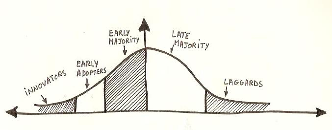
Digital education research is focused primarily on the innovators and early adopters whereas my interest is low adoption and establishing an inclusive digital baseline from which to move forward. This can only be done through research into how colleagues conceptualise teaching and learning, how they negotiate digital shifts in practice, develop digital fluency and establish digital presence, in itself an under researched area with regard to learning and teaching.

See you on Twitter Sunday morning!

#phdweekend #phd forum #phdchat #phd life


Images

borrow my eyes

The Public Sector Bodies (Websites and Mobile Applications) Accessibility Regulations 2018 puts digital inclusion in the spotlight. It’s waving the diversity flag, calling for greater attention to digitally inclusive practice.

For a number of years I’ve had an eye condition called Uveitis. It’s treated with steroid drops and

  sometimes

injections

          in the eye

I see the needle coming!

The pupil is dilated, letting in too much light and blurring my vision.  It’s a first-class experience of sight impairment.

For several years, I helped people with sight loss to use the internet. Before that I set up DITTO (Disabled Information Technology Training Opportunities) at Centre 88, in Hull. Experiences like these showed how inclusive practices are essential for digital equality.

Inclusion matters, not just to function in a digital society but to maintain independent living, one of those things where – as Joni Mitchell sang – you don’t know what you’ve got till it’s gone.

Borrow my eyes

Share the fog.

image showing text with different sight loss conditions
image source was Skills for Access which is no longer available

Font, size, colour and contrast make all the difference.

Before anyone shouts browser controls, let’s be clear from the start, they’re no guaranteed solution. You could even say they’re abjuration of responsibility, peddled by those with high digital skills and low experience of discrimination.

Browser controls need users to be digitally literate and read small print. Even more importantly, to work effectively they require content to be accessibly designed in the first place. So before I get dismissed yet again for saying browser controls are not the answer – hear me out.

Please.

Many of those with vision impairment are unable to read the browser menus.

These are often unresponsive to zoom (see examples further down) and not everyone with sight loss uses a screen reader which accesses content ‘hidden’ in the html.

Assumptions are dangerous.

It’s a perfect storm.

Examples…

Text unresponsive to resizing line length I often work with high magnification so it’s really frustrating when enlarged body text size on websites doesn’t wrap around the screen.  If I have to scroll horizontally to find the end of the line I soon give up. Also, scroll bars themselves don’t magnify – their colour merges rather than stands out – and the largest size mouse pointer isn’t large enough. All this makes scrolling difficult. I need text to be responsive.

The image below shows a typical text heavy content.

Image One – typical page  

imges showing text on the screen

Image Two shows the text has magnified perfectly because the designer has chosen a responsive layout option. The ‘Word Art;’ appearance of the title text is best avoided. Tired eyes struggle with shadow and 3D effects. I’ve also changed the colour contrast using a Chrome app. .

Note how the text in the Chrome Contrast App menu remains too small to read.

Image Two – differential text size  

image shows high contrast menu is fixed with regard to text and colour

Associated with this is the issue of printing.

Many web pages send content to print using font size which is 10 pt or less. It’s too small!

This can be fixed at the design stage by creating a print version.. Better still would be a user control option whereby I can state my preferred text print size. Is this possible? I don’t know but it would be helpful if Chrome. Microsoft or Apple took this on as standard practice.

WordPress have a plugin whereby blog pages convert to readable font for printing. If you use WordPress please add this BUT the free WordPress option – like this Digital Academic blog – doesn’t allow plugins. It’s so frustrating.

The images below show another example of menu text which does not resize. this time it’s Windows.

Come on Microsoft. It’s such an obvious issue.

Image Three – default windows display colours 

default windows display colours

Image Four below  is using Windows ‘High Contrast #1’ option. Image Three above is the Default Display with no contrast added.  Compare the Header/Title Bar and Footer/Taskbars. 

For me, the High Contrast #1 option is more difficult to see. It’s unclear how Image Four can be considered an improvement on the default settings shown in Image Three.

Image Four – high Contrast Windows display options

The version of Windows I’m using offers four high contrast display options. Image Five below shows an option while Image Six shows the Google search page and WordPress Dashboard are resistant to these styles.

Image Five – high Contrast Windows theme

Windows High Contrast colors theme

Image Six – High Contrast theme with Google and WordPress

Where the contrasts appear to work (Office  programmes like Word) the effects are local so a PowerPoint prepared using a High Contrast theme will lose all its colours when opened elsewhere. There should be ways round this but how many people are digitally literate enough to work it out?

i haven’t gone into the issue of digital skills and capabilities in this post but it needs saying – to create and access digitally inclusive content requires a digital literate practice. Where do people go to learn this?

Other sources of frustration…

Using the Tooltips option to give additional information can be useful, in particular for screen readers, but I don’t use one and because the font size doesn’t respond to magnification,  I can’t read Tooltips text.

Image Seven – tooltips text 

Too often, accessibility tools are tokenistic rather than realistic.

Windows offers a magnifer but have you tried using it?

It’s mouse controlled (which comes with its own accessibility issues). It’s annoyingly jumpy and the text pixellates on high zoom (see Image Eight below). This is something Microsoft really could and should have sorted.

Image Eight – text pixellates with the Windows magnifier  

Differential magnification has been referred to with regard to menu text. It’s also an issue with programmes, for example Outlook (Image Nine) and NVivo (Image Ten) where only text in the ‘working’ window is resizable.

Image Nine – Outlook  

I’m currently using NVivo for thematic data analysis. It’s a powerful programme but doesn’t support increasing text size anywhere other than the reading pane.

Image Ten – NVivo 

image showing text size in NVivo

The same applies to Webinars (Connect, Collaborate etc) where the chat window doesn’t support increasing font size and these are only a few examples!

Image Eleven  below shows a gmail message magnified to a size I can read BUT the left menu column expands with the right. I can’t reduce it, fix it or close it – even though I don’t need it. What I find is the enlarged reading pane has no scroll bars for moving up and down or across. Why not? For all scroll bars tend to be too small with poor colour contrast, not having them at all renders the page inaccessible.

Image Eleven – gmail  

imge showing gmial on high zoom with no scroll bars

While on the topic of Google, Image Twelve below is from my laptop. Google have one of those annoying header banners which resizes along with the text. As a result it takes up 50% of the screen, defeating the value of increasing the text size of the content.

Image Twelve – google header size  

image showing google header banner

Have I mentioned the scroll bars!

In early versions of Windows there was a customised option whereby you could select individual features like scroll bars and buttons and change their appearance. I haven’t seen that for years. Why aren’t commercial giants like Microsoft and Google doing more to offer practical, day-to-day customisation options.

Put the term ‘browser controls’ into Google and you’ll get a host of links about parental controls – any immediate association with accessibility is missing from the algorithm.

Following standard advice, I search for help. The suggestion is to install accessibility extensions (See Image thirteen below)

How many people know what these are? The instruction highlighted in blue in Image Thirteen below is not helpful – how do you know what extension you want? It comes back to the point I started with. Most users know what they need to know to do what they need to do. The language of accessibility is unfamiliar.

Image Thirteen – accessibility extensions 

Chrome instructions for finding accessibility extensions The full list of extensions can be seen here Take a look…are the titles meaningful for you? I can guess what a Color Contrast Analyzer is but the Chrome Automaton Inspector? More intuitive language would be helpful.

These days a thin grey font on a white background seems to be the fashion but the poor contrast between foreground and background means I struggle to read it. The same for text over images and content which is fully or centre justified. When your eyes are tired, text needs to be easy to read. Left justification takes one click to do and makes all the difference.

A final grumble…(for now!)

For years I’ve relied on the keys Ctr+ and Ctrl- to adjust the size of digital text and images. Quick, easy and free, I prefer it to the zoom controls because it gives me control over text size which seems fundamental in terms of access. Lately I’ve noticed a new practice creeping in. Ctrl+ scrolls down the page instead of zooming in. WHY?

magnifying glass

Why is always a good question.

Why does digital exclusion matter?

Why isn’t accessibility the start and end point for all digital design courses, programmes and modules – teaching and training – policy and practice?

Why the invisibility?

lack of status?

A topic the next blog post maybe…

postscript

I’ve been asked to include scanning text documents and sending them as pdf – this creates an image which can’t be read by any text to speech software and cant be enlarged without losing clarity.

Also – please – no text over images. The example below uses capital letters (which research shows takes longer to read and understand). The best practice is to put the text in a block of colour instead.

image showing ways to layout text on images

Check all content resizes on zoom – I still see examples which are unresponsive where text overlays other text on high magnification. Ctrl+ and Ctrl- is a quick way to zoom in and out.

contet showing text overlying text


digital blindness and rethinking Maslow’s Hierarchy through a digital lens

hand holding a mobile phone
image from http://ddnews.gov.in/health/blue-light-smartphones-may-speed-blindness

Digital blindness is increasingly common.

The medical risks are growing but blindness to digital theory and practice are also a concern.

Too often the creators and shapers of our online lives assume the prerequisite digital literacies are in place but assumptions are not enough. Sit in any social learning space for an hour and it becomes clear how many are unable to maximise a screen or name and save a file. Anyone supporting learnng and teaching will have similar stories to tell.

Higher education appears blind to the need for developing individual digital literacies and confidence.

Why is this?

For centuries, universities have been about knowledge acquisition. Students as buckets. Turn on the knowledge tap. Fill them up. A consequence is approaches to digital accessibility have tended to follow similar transmission models. The reality is simply putting information out there isn’t enough to change hearts and minds.

Check out the OU Innovating Pedagogies series and the NMC Horizon reports then ask yourself where do staff go to learn to be so digitally confident?

drawing of a seesaw with a cartoon grey brain and red heart
image from https://pixabay.com/en/brain-head-psychology-closed-mind-2146159/https://pixabay.com/en/brain-head-psychology-closed-mind-2146159/

The 21st century has seen a massive shift from teacher-teaching to student-learning, but places, people and practice remain unchanged. Students arrive expecting to be lectured, PowerPoint slides are overloaded. Delivery speeds up towards the end to fit everything in. We’ve all done it. It’s easier to use tried and tested methods than step into new territory.

When it comes to the digital agenda, the map is still being drawn. We need to rethink and repurpose.

Children become literate from an early age. They learn from schools and families but when it comes to digital literacies, which are arguably more broader and complex than ‘read and write’,  adults adopt DIY approaches. In higher education digital literacies exist on multiple levels. Core keyboard and screen literacies, the use of mobile devices and app culture, cloud computing, digital pedagogies and the digital fingerprints belonging to individual subject disciplines. Everything has a digital dimension.

All the elements of Maslow have digital equivalents.

repurposed Mslow Hierarchy of Needs Pyramid
repurposed image original from https://commons.wikimedia.org/wiki/File:Maslow%27s_hierarchy_of_needs.svg 

A digital hierarchy begins with connectivity. Who hasn’t felt panic when realising your mobile phone’s at home or there’s no wifi in the remote cottage you’ve booked for a week.

Digital data has become our dominant currency.  Everything done online creates data footprints. Citizens need to work and function effectively in digital environments. Government and NHS have shifted to Digital-first while higher education is dependent on digital administration and virtual learning environments. The data this produces is increasingly being used to inform policy ad practice.

Relationships are developed, maintained, enhanced and ended through social media and apps for communication, collaboration and file sharing.  Our online practice creates digital presence. Whether these digital images are true or false the evidence suggest the ways we perform identity online are integral to mental wealth and wellbeing.

At the top of Maslow’s Hierarchy is Self-Actualization; becoming the best possible version of ourselves and realising potential. This is about self-fulfillment, which relates to the images we present. I’d suggest solely analogue means are no longer sufficient for living, learning and working in the digital age.

selection of digital tools and devices
image from https://pixabay.com/en/laptop-technology-computer-business-3244483/

I’ve been in higher education since the turn of the century and watched society become more and more dependent on digital literacies. Blindness to this is both metaphor and physical reality.

Digital is a massive agenda and by refusing to address it from universal, joined up perspectives, the sector has failed its staff across the board.

As a consequence, universities are failing students.

My concern is that digital blindness is infectious.

Becoming digital is an issue for higher education on so many levels. Teaching and learning, administration, employability and internationalisation while inclusive and accessible practice are essential elements for quality assurance via programme approval and validation  – the list could go on and on…

There’s a scattering of diverse groups and practices addressing digital inclusion, all excellent in their own way but too often isolated from each other.

While writing this I’ve been listening to the Jisc Webinar on the EU Accessibility Directive. https://www.jisc.ac.uk/training/new-regulations-new-risks-online-briefing

Details can be found in this blog post asking how much real difference the regulations will make.

It was affirming to see so many people on the Jisc webinar who care about creating accessible digital futures. I pledged to complete a post called ‘Borrow my Eyes’ which is about my own experiences with inaccessible online content.

Watch this space – it will be following soon…

mobile phone against a background of digitla faces
image from https://pixabay.com/en/smartphone-hand-photomontage-faces-1445489/