Digital practice

image showing digital code
image from https://pixabay.com/en/web-network-programming-3706562/

Mistakes can be useful learning tools but we’re rarely rewarded for getting something wrong.

Another way to learn is to have something you’ve become used to taken away.

My biggest learning curve with regard to digital practice was on the MA Open and Distance Learning with the OU. It was a fully online course with lots of different platforms plus we were piloting their MyStuff portfolio when such tools were still new. The MA was also my first experience of virtual meetings with audio and I still remember how I jumped when the tutor’s voice boomed out at me from my laptop as I entered the online room!

The course had an international cohort which was another fresh experience. Comparing education as I knew it with what was happening in countries like Russia and the US provided valuable knowledge but I learned most of all from the final two modules.

image showing an open book and pair of glasses
image from https://pixabay.com/en/knowledge-book-library-glasses-1052010/

I chose one from Psychology and one from Social Science without realising they hadn’t been transferred to online formats. Typically, I’d assumed all the OU units would be like the ones I’d just taken.  When the courier arrived with a box of books, papers and a DVD I realised my mistake. This was my course. There were no online forums, no virtual meetings and if I wanted to speak to my tutor I had to book a phone call.

The resources were good. I still have them. But the greatest learning came from not having the digital communication and collaboration I’d become used to. Without these I appreciated their value in a way I never would have done otherwise.

It was the same with the assessment centres. I had problems parking, arrived late, and struggled with the physical writing. I sent emails and used social media. I no longer wrote letters and did little more than sign my name by hand. For days afterwards my arm and shoulder ached and I still haven’t forgotten how it felt to be sat in a room with over 30 people all scribbling away in various states of stress as the clock ticked and the temperature rose.

rows of empty desks and chairs
image from https://pixabay.com/en/empty-exam-hall-deserted-nobody-314554/

Students still take examinations in this style.

Many VLE still look like content repositories when they can offer so much more.

Technology-first approaches to blended and distance courses are still common when all the evidence suggests a pedagogy-first path for the design of teaching and learning online is a more effective method.

I’ve been thinking of these experiences as I come to the end of my PhD. We’re discussing eternal examiners and planning a mock viva in preparation for the final defence. The end is in sight but I’m not there yet. There are still hurdles to jump. In the meantime, I’ve learned so much.

My research is practice-based. Participants were enrolled on my online courses, Teaching and Learning in a Digital Age (TELEDA). I was an insider, both at the university and as the developer and facilitator of the programmes.  Each of the three iterations of TELEDA were 30 level 7 credits and on the advice of the external examiner I had the validation booked for merging two modules into a PG Cert in Digital Education. A restructure halted those plans and instead TELEDA became a Diploma level option on a new MA in Teaching and Learning in Higher Education.  It looked good on paper but institutional changes prevented it from happening.

Last year, with my colleague Patrick Lynch, we developed a pedagogy-first approach to enhancement called Design for Active Learning (D4AL). With or without technology, we explained, but its 2018, the tech will be in there somewhere, we’re just choosing not to lead with it. Again, progress was affected by changes we had no control over.

CMALY accreditation badge
image from https://www.dontwasteyourtime.co.uk/cmalt/

When I gained my Certified Membership of ALT (CMALT) there were less than 100 certified learning technologists in the country. Today there are many more and for the past few years I’ve been a CMALT assessor. The portfolio submission has to address the design of learning yet the majority of people who apply are technologists. This reinforces the on-campus divides between those who promote technology enhanced learning and those who practice it on a day-to-day basis with students.

How can higher education institutions do more to develop their staff who teach and support learning to become digitally fluent practitioners?

TELEDA was successful.  I have a mass of data which confirms the value of experiential approaches to digital practice, in particular for later adopters of online ways of working. I know many participants took their TELEDA learning and applied to their own practice which was the original intention. Staff were enrolled as students on the institutional VLE and for many this itself was transformational. Getting lost online helped them rethink their own practice as did the supportive introductions to social media and creating audio and video as supplements for text. TELEDA covered learning design and assessment. It introduced the philosophy and practice of open education. We read and discussed seminal papers around the digital native and digital immigrant debate and Siemen’s Connectivism. It was an ideal opportunity to introduce accessibility of content as being of benefit to everyone and show how VLE and other digital tools supported widening participation and increasingly diverse student cohorts.MS Office 365 logos

image from http://www.iconarchive.com/show/microsoft-office-2013-icons-by-carlosjj.html

All this is in the thesis and published in a range of books and papers. I’ve learned a lot over the years about digital practice and like to think TELEDA is remembered by colleagues as a worthwhile investment of their time.

I’ve also seen a lot of changes in higher education and, like many others, have concerns about the future.  I remain convinced that VLE offer genuine opportunities for participation in transformational higher education experiences, in particular for students who are unable to enjoy a full time on-campus degree.

However, developing the necessary digital practice of staff who teach and support learning needs more investment. This is likely to remain the biggest hurdle of all.

image showing a fence in woodland
image from https://pixabay.com/en/gateway-the-fence-wood-fencing-1277010/

borrow my eyes

The Public Sector Bodies (Websites and Mobile Applications) Accessibility Regulations 2018 puts digital inclusion in the spotlight. It’s waving the diversity flag, calling for greater attention to digitally inclusive practice.

For a number of years I’ve had an eye condition called Uveitis. It’s treated with steroid drops and

  sometimes

injections

          in the eye

I see the needle coming!

The pupil is dilated, letting in too much light and blurring my vision.  It’s a first-class experience of sight impairment.

For several years, I helped people with sight loss to use the internet. Before that I set up DITTO (Disabled Information Technology Training Opportunities) at Centre 88, in Hull. Experiences like these showed how inclusive practices are essential for digital equality.

Inclusion matters, not just to function in a digital society but to maintain independent living, one of those things where – as Joni Mitchell sang – you don’t know what you’ve got till it’s gone.

Borrow my eyes

Share the fog.

image showing text with different sight loss conditions
image source was Skills for Access which is no longer available

Font, size, colour and contrast make all the difference.

Before anyone shouts browser controls, let’s be clear from the start, they’re no guaranteed solution. You could even say they’re abjuration of responsibility, peddled by those with high digital skills and low experience of discrimination.

Browser controls need users to be digitally literate and read small print. Even more importantly, to work effectively they require content to be accessibly designed in the first place. So before I get dismissed yet again for saying browser controls are not the answer – hear me out.

Please.

Many of those with vision impairment are unable to read the browser menus.

These are often unresponsive to zoom (see examples further down) and not everyone with sight loss uses a screen reader which accesses content ‘hidden’ in the html.

Assumptions are dangerous.

It’s a perfect storm.

Examples…

Text unresponsive to resizing line length I often work with high magnification so it’s really frustrating when enlarged body text size on websites doesn’t wrap around the screen.  If I have to scroll horizontally to find the end of the line I soon give up. Also, scroll bars themselves don’t magnify – their colour merges rather than stands out – and the largest size mouse pointer isn’t large enough. All this makes scrolling difficult. I need text to be responsive.

The image below shows a typical text heavy content.

Image One – typical page  

imges showing text on the screen

Image Two shows the text has magnified perfectly because the designer has chosen a responsive layout option. The ‘Word Art;’ appearance of the title text is best avoided. Tired eyes struggle with shadow and 3D effects. I’ve also changed the colour contrast using a Chrome app. .

Note how the text in the Chrome Contrast App menu remains too small to read.

Image Two – differential text size  

image shows high contrast menu is fixed with regard to text and colour

Associated with this is the issue of printing.

Many web pages send content to print using font size which is 10 pt or less. It’s too small!

This can be fixed at the design stage by creating a print version.. Better still would be a user control option whereby I can state my preferred text print size. Is this possible? I don’t know but it would be helpful if Chrome. Microsoft or Apple took this on as standard practice.

WordPress have a plugin whereby blog pages convert to readable font for printing. If you use WordPress please add this BUT the free WordPress option – like this Digital Academic blog – doesn’t allow plugins. It’s so frustrating.

The images below show another example of menu text which does not resize. this time it’s Windows.

Come on Microsoft. It’s such an obvious issue.

Image Three – default windows display colours 

default windows display colours

Image Four below  is using Windows ‘High Contrast #1’ option. Image Three above is the Default Display with no contrast added.  Compare the Header/Title Bar and Footer/Taskbars. 

For me, the High Contrast #1 option is more difficult to see. It’s unclear how Image Four can be considered an improvement on the default settings shown in Image Three.

Image Four – high Contrast Windows display options

The version of Windows I’m using offers four high contrast display options. Image Five below shows an option while Image Six shows the Google search page and WordPress Dashboard are resistant to these styles.

Image Five – high Contrast Windows theme

Windows High Contrast colors theme

Image Six – High Contrast theme with Google and WordPress

Where the contrasts appear to work (Office  programmes like Word) the effects are local so a PowerPoint prepared using a High Contrast theme will lose all its colours when opened elsewhere. There should be ways round this but how many people are digitally literate enough to work it out?

i haven’t gone into the issue of digital skills and capabilities in this post but it needs saying – to create and access digitally inclusive content requires a digital literate practice. Where do people go to learn this?

Other sources of frustration…

Using the Tooltips option to give additional information can be useful, in particular for screen readers, but I don’t use one and because the font size doesn’t respond to magnification,  I can’t read Tooltips text.

Image Seven – tooltips text 

Too often, accessibility tools are tokenistic rather than realistic.

Windows offers a magnifer but have you tried using it?

It’s mouse controlled (which comes with its own accessibility issues). It’s annoyingly jumpy and the text pixellates on high zoom (see Image Eight below). This is something Microsoft really could and should have sorted.

Image Eight – text pixellates with the Windows magnifier  

Differential magnification has been referred to with regard to menu text. It’s also an issue with programmes, for example Outlook (Image Nine) and NVivo (Image Ten) where only text in the ‘working’ window is resizable.

Image Nine – Outlook  

I’m currently using NVivo for thematic data analysis. It’s a powerful programme but doesn’t support increasing text size anywhere other than the reading pane.

Image Ten – NVivo 

image showing text size in NVivo

The same applies to Webinars (Connect, Collaborate etc) where the chat window doesn’t support increasing font size and these are only a few examples!

Image Eleven  below shows a gmail message magnified to a size I can read BUT the left menu column expands with the right. I can’t reduce it, fix it or close it – even though I don’t need it. What I find is the enlarged reading pane has no scroll bars for moving up and down or across. Why not? For all scroll bars tend to be too small with poor colour contrast, not having them at all renders the page inaccessible.

Image Eleven – gmail  

imge showing gmial on high zoom with no scroll bars

While on the topic of Google, Image Twelve below is from my laptop. Google have one of those annoying header banners which resizes along with the text. As a result it takes up 50% of the screen, defeating the value of increasing the text size of the content.

Image Twelve – google header size  

image showing google header banner

Have I mentioned the scroll bars!

In early versions of Windows there was a customised option whereby you could select individual features like scroll bars and buttons and change their appearance. I haven’t seen that for years. Why aren’t commercial giants like Microsoft and Google doing more to offer practical, day-to-day customisation options.

Put the term ‘browser controls’ into Google and you’ll get a host of links about parental controls – any immediate association with accessibility is missing from the algorithm.

Following standard advice, I search for help. The suggestion is to install accessibility extensions (See Image thirteen below)

How many people know what these are? The instruction highlighted in blue in Image Thirteen below is not helpful – how do you know what extension you want? It comes back to the point I started with. Most users know what they need to know to do what they need to do. The language of accessibility is unfamiliar.

Image Thirteen – accessibility extensions 

Chrome instructions for finding accessibility extensions The full list of extensions can be seen here Take a look…are the titles meaningful for you? I can guess what a Color Contrast Analyzer is but the Chrome Automaton Inspector? More intuitive language would be helpful.

These days a thin grey font on a white background seems to be the fashion but the poor contrast between foreground and background means I struggle to read it. The same for text over images and content which is fully or centre justified. When your eyes are tired, text needs to be easy to read. Left justification takes one click to do and makes all the difference.

A final grumble…(for now!)

For years I’ve relied on the keys Ctr+ and Ctrl- to adjust the size of digital text and images. Quick, easy and free, I prefer it to the zoom controls because it gives me control over text size which seems fundamental in terms of access. Lately I’ve noticed a new practice creeping in. Ctrl+ scrolls down the page instead of zooming in. WHY?

magnifying glass

Why is always a good question.

Why does digital exclusion matter?

Why isn’t accessibility the start and end point for all digital design courses, programmes and modules – teaching and training – policy and practice?

Why the invisibility?

lack of status?

A topic the next blog post maybe…

postscript

I’ve been asked to include scanning text documents and sending them as pdf – this creates an image which can’t be read by any text to speech software and cant be enlarged without losing clarity.

Also – please – no text over images. The example below uses capital letters (which research shows takes longer to read and understand). The best practice is to put the text in a block of colour instead.

image showing ways to layout text on images

Check all content resizes on zoom – I still see examples which are unresponsive where text overlays other text on high magnification. Ctrl+ and Ctrl- is a quick way to zoom in and out.

contet showing text overlying text


Will the new Accessibility Regulations make any real difference?

closed padlock on a shut dor

On 23 September, 2018, the EU Web Accessibility Directive became law. The Public Sector Bodies (Websites and Mobile Applications) Accessibility Regulations 2018 calls for websites and mobile applications of public sector bodies to meet an accessibility requirement. While not explicitly referring to ‘Virtual Learning Environments (VLEs), course documents, and video recordings of lectures’ as listed by Wonkhe the need for online content to be perceivable, operable, understandable and robust (WCAG 2.0) strongly suggests this is the case.

However, it isn’t obvious.

The majority of media coverage I’ve seen so far prioritises the technical structures of websites and mobile apps. Neither Jisc’s Accessible Organisations or Gov.uk’s Make your public sector website or app accessible make explicit reference to resources for teaching and learning.

white plasticine person carrying a gold key

So already I’m confused. Exactly what does the law say with regard to the day-to-day digital documents uploaded to institutional VLEs?

It seemed I had to do what my first supervisor always advised – read the original text. I started with the European Directive.

Ignoring the paradox of centre alignment, capital letters and fully justified paragraph text!

There are two references to intranets

(34) Member States should be able to extend the application of this Directive to other types of websites and mobile applications, in particular intranet or extranet websites and mobile applications not covered by this Directive which are designed for and used by a limited number of persons in the workplace or in education….

Paragraph 37 was more helpful with regard to accessibility requirements.

(37)

The four principles of accessibility are: perceivability, meaning that information and user interface components must be presentable to users in ways they can perceive; operability, meaning that user interface components and navigation must be operable; understandability, meaning that information and the operation of the user interface must be understandable; and robustness, meaning that content must be robust enough to be interpreted reliably by a wide variety of user agents, including assistive technologies. (my emphasis)

So there it is!

If content has to be robust it has to be accessible.

It seems the detail is in the exemptions. The Directive refers to the content of extranets and intranets while the UK statute, the Public Sector Bodies (Websites and Mobile Applications) Accessibility Regulations also list content under the exemptions.

(2) ‘These Regulations do not apply to the following content of a website and mobile application of a public sector body

  • office file formats published before 23rd September 2018…
  • pre-recorded time-based media published before 23rd September 2020.

Office file formats are defined as ‘a document in a format that is not intended primarily for use on the web and that is included in web pages, such as Adobe Portable Document Format, Microsoft Office documents or their open-source equivalents.’

It sounds like everything uploaded to a VLE has to comply.

The law came into force this week. All new content has to be compliant within one year and existing websites within two years..

I should be delighted, I think.

black silhouette of a person juming for joy against a background of words meaning delight

Instead, I’m not sure what real difference this will make.  Accessibility is an attitude as much as a practice. It’s complex.  While the new law makes it clear the structures of websites and apps must be accessible, it could have done more to define the nature of the digital content it applies to.

PDF, Word, PowerPoint, audio and video are probably the most frequently used file formats by staff who teach and support learning.  Is the law really saying each of these have to be accessible i.e. follow WCA2 and be perceivable, operable, understandable and robust? If so it would be useful to see this stated more explicitly.

MS Office logos

I have questions.

What about teaching and learning material on institutional blogs, or student work posted on sites provided by universities, or feedback given using audio or video on a VLE?

Changing practice requires a sound rationale. You shouldn’t need to be a lawyer to understand the law but this is how it feels with regards to the Regulations .

I feel bad about my lack of enthusiasm but revisiting the Digital Soapbox  shows some of the breadth and scale of digital exclusion issues.

These posts go back eight years. What has changed?

Digital inaccessibility is the scandal of 21st century. The social model with regard to the built environment is broken every day. Categories of ‘disablement’ grow incrementally year on year, while support for equal opportunities for access and participation gets less.

black and white image of a wheelchair on the edge of a kerb

Digital exclusion is part of larger structured attitudes towards difference and diversity. For all legislation is needed as a baseline, I’m not sure these new Accessibility Regulations will make a great deal of difference to day-to-day practice.

Lee Fallin and I have been looking for ways to support digitally inclusive literacy and developed this poster suggesting changes in habits with digital content e.g. selecting a good colour contrast and a readable font.

Following the tips on Designing for diverse learners could make a big difference to how students access text, images and multimedia. The new Accessibility Regulations are big on structures but vague on content. Ensuring accessible resources comes down to the basics with text and image. This is our starting point and the poster is freely available to anyone who wants to use, reuse or repurpose it.

Accessibility was a fundamental ambition of the early web pioneers.

‘The power of the Web is in its universality. Access by everyone regardless of disability is an essential aspect.’ Tim Berners Lee (1997) World Wide Web Consortium (W3C) Launches Web Accessibility Initiative. WAI press release 7 April 1997. www.w3.org/Press/WAI-Launch.html

The impact of this project on the users with disabilities is to give them the same access to information as users without a disability. In addition, if we succeed making web accessibility the norm rather than the exception, this will benefit not only the disability community but the entire population.”  Daniel Dardailler (1997) W3C Web Accessibility Initiative Project Manager Telematics Applications Programme TIDE Proposal.Web Accessibility Initiative (WAI) http://www.w3.org/WAI/TIDE/f1.htm 

Twenty years on digital content is more inaccessible than ever.

Will these regulations make any real difference?

Hating to say it, but I’m not sure they will.

Please, somebody tell me I’m wrong!

be the change

laptop with the countries of the world

The end of 2017 has been marked by a two incidents. First was the laptop. A complaint was made about me using one in a meeting – ergo I was not paying attention. A week later the issue of devices in meetings came up again. Different context but same person who clearly feels strongly about the subject. I have some sympathy. Over the years presenting/lecturing has changed. These days we look over a sea of bent heads rather than people’s faces but I believe banning devices is not the answer. We need to find ways to work with them rather than deny their presence and affordances.

pink and green direction arrows

This time I spoke up. Explained a laptop need not signify Facebook or catching up with email – for me it was like a reasonable adjustment – when my eyes are bad it’s easier to make notes in a strong, bold font than to write by hand.

Hold that thought…

The second incident was a conversation with a lecturer who said it isn’t the job of academics to show students how to use the VLE or develop digital literacy.  This explained a lot. Here I was face-to-face with the on-campus digital divide.

Again, I have sympathy. Academics have seen big changes in HE.  The spectre of  the internet lurks in dark corners. There’s no avoiding digitisation and not everyone lives comfortably in the digital world.

digital divide with a page and an ipad

There are those who blog, tweet, join #lthechat, network online, and generally support the use of education technologies in a variety of ways and means.

There are those who object to the use of mobile devices and don’t see developing digital graduate attributes as part of their remit.

book, phone and keyboard

This takes us back to the tribes and territories of the TEL People. How like attracts like and if your role is about technology, the chances are you  tend to work with staff who use it willingly. The more digitally shy won’t come to your lands or speak your language and on those rare occasions we venture into their worlds, we’re often viewed with suspicion. We’re the techies, geeks, magicians of code with esoteric skills. We are Othered.

This digital divide – cue lightbulb – means embedding digital graduate attributes into modules, or using VLE tools which support collaborative online working, is not going to happen without structural change.

Right?

It’s not going to happen if things stay the way they are.

image of keyboard and social media icons from pixabay

This is where we are:

  • 30 years of computers in education.
  • 20 years of VLE at universities.
  • 10 years of Web 2.0 style social media supporting user-generated content and file sharing.

In the second decade of 21st century, I get a complaint about using a laptop in a meeting.

Christmas is coming and mobile devices are high on present lists. The age at which children get connected drops every year.  For all its critique, the phrase ‘digital native’ actually fits because they’ve never known an analogue world.

Typical ‘fresh-from-school’ students arrive with a set of digital social practices, honed through their teenage years, replicated and reinforced by family and friends, taken advantage of by media advertisers. In short, their internet experience mirrors the society they live in.

a borken mirror with the text Black Mirror in white capital letters

Charlie Brooker’s Black Mirror is either prescient or stating the bleedin’ obvious. Of course this is what lies ahead. If you haven’t watched the series you should. Be scared, very scared – but at least be prepared for the future and understand the value of critique.

In the same way car engines have become more mysterious, people engage in digital life with no understanding of how it works. It just does. In the way the ignition fires the engine, our devices connect and our personalised digital landscape unfolds. But not for everyone.

Many working in HE don’t have digital footprints and rarely use the internet for anything other than email or access to university systems.

mobil phon with a landscape of trees and a castle emerging from the screen

They’re not alone. A recent Lloyds Bank report states “More than 11 million people in the UK do not have basic digital skills. One out of every 11 completely avoids the internet.”  while the House of Commons Science and Technology Committee reports a digital skills crisis. There’s more research about people not being online than how to encourage the critical skills and capabilities of those already there.

What can we do?

As learning technologists, as enhancers of learning and teaching – with or without technology (but in 2018 it’s likely to be there) – we have a responsibility to bridge on-campus digital divides. Its not just reaching the digitally shy and resistant, it’s promoting critical digital skills as being integral to other HE literacies and specialisms.

laptop wth screen showing the words Fake News

We have to find ways to start conversations about digital graduate attributes and digital CPD for staff. We need to leave our Territories of TEL and get into the heart of the university. Align our work with that of the learning development and academic practice teams, with those talking about learning gain, employability awards, TEF work and not forgetting the importance of the student voice in all of this.

Remember the thought from the top of the page – the one about reasonable adjustments?

TEL people need to talk about inclusive practice, how digital technologies can widen and support access but at the same create barriers. The sector is moving towards inclusion as the norm, reasonable adjustments as universal design. Watch this space. In January the Digital Academic soapbox will be out.

image showing a drawing of a bar of soap and a box representing a digital soapbox

Let’s be the change we want to see in the world.

Rethink the relationships between institutions, staff and students.

Revisit our digital lenses. They need a clean and polish every now and then and sometimes a shift in their focus.

The time has come.

Seasons greetings to one and all.

a merry christmas message

Accessibility Matters Part Two

cartoon figure holding a sign saying access denied
Accessibility can be hard work.

Accessible content requires the user to jump over hoops.

It gets tiring. Frustrating. No one understands unless they’ve been there too.

Most ‘accessible practice’ is lip service… tokenism.

Here’s an example of the separation between theory and practice. I followed an interesting looking tweet (as you do) to a blog by Wendy Mitchell @WendyPMitchell who was diagnosed with Young Onset Dementia in her fifties. Visit Wendy’s website Which Me Am I Today for more details.

Wendy Mitchell website banner showing a view over a lake surrounded by hills

Wendy raises awareness about what the condition is like, in particular what it means for her in daily life. At one such event three ‘healthcare professionals’ had arrived to join her.

‘Two nurses were from the Learning Disabilities team and one from Mencap. We were also joined by Acho from the Recovery College ….They all dealt with people with dementia so I went through all my challenges and simple solutions. They, like many professionals weren’t aware of dementia affecting so many of our other senses so I filled them in on that as well.’

Here lies the heart of the issue. Unless you’ve had personal or 1-2-1 experience of impairment or disability you don’t know what the day-to-day reality is like. If ‘health care professionals’ don’t know the full story then what hope is there for digital content designers and internet providers to create fully accessible and inclusive online environments.

The topic of last week’s #lthechat + #HEAchat was designing interaction for diverse cohorts with Dr Pauline Hanesworth. Many answers to the first few questions included  suggestions of what diversity might look like. Try to define this yourself. By definition, diversity is broad because humanity contains a complex array of difference. Designing for diversity is almost always going to be impossible. So let’s turn it around

tweets from #lthechat

Rather than identification of the constituent parts of a diverse student cohort, we should focus on preventing barriers to access instead – put inclusive practice first –and promote the principles of inclusive design. While there will never be a one-size-fits all model e.g. multimedia will always have exclusive parameters, creating and making time to think about the issues. Learning the value of alternative formats (textual equivalents which can be customised to suit user requirements) is always time well spent.

My colleague Lee Fallin got it…

tweets from #lthechat

tweets from #lthechat

It’s always comforting to find like minded people – who understand the need need to get beneath the academic theorising to the nitty gritty reality – the practical steps everyone can take to ensure their content reaches the greatest number. After all, equality legislation was always about being proactive – about anticipating requests for alternative formats – and providing them at source rather than them having to be asked for.

What went wrong? Why does society seems to be taking backward steps?

In the 1990’s the three Equality Commissions did some fantastic work campaigning and raising awareness of discrimination around the triad of disability, age and sex. When disbanded, replaced by the Equality and Human Rights Commission, dilution of focus was predictable. The single Equality Act introduced a host of protected characteristics – all of which matter – don’t get me wrong, I’m not saying they don’t.

What I am saying is attention to disability over the years seems to have become blurred and relegated to a back seat. Changes to the benefit system are bad enough – for every so called Daily Mail ‘scrounger’ and ‘benefit cheat’ there are thousands whose physical and cognitive impairment, often through no fault of their own, makes participation in society both challenging and difficult.

image of a broken mirror from pizabay

We’ve reached a state where some individuals with genuine ‘disability’ now have fears about disclosure, who feel they have to disguise integral aspects of themselves in case of negative repercussions, in particular from those with no idea of what it’s like to live in 2017 – in a society which seems to be taking backwards rather than forward steps around access to the built environment – e.g. dropped kerbs which take away the distinction between pavements and roads, street art with no warning of obstruction and it’s not just the real world – it’s the digital one too. This is what concerns me the most. In a society when the platforms of the public sphere are digital and the provision of welfare is first and foremost, where the NHS policy is Digital First, then to be digitally excluded is to be silenced, discriminated against and excluded.

access denied sign with red figure sat looking downcast
image from https://www.dreamstime.com/stock-illustration-access-denied-sign-clipping-path-included-image-image60841223

What can be done?

Access to higher education is so important to get right. The cost alone is bad enough without having additional struggle with processes and resources. Attitudes such as insistence on PDF formats, seeing accessibility as the sole responsibility of Disability Services, ignoring the need for textual equivalents to video/audio, acceptance of inaccessible environments like ebooks, provision of new digital content which breaks basic guidelines on colour, contrast and navigation – it’s all around us.

I believe digital inclusion and accessible working practices should should be the seventh element of the Jisc Digital Capabilities model

At the moment it isn’t there – why not?  It suggests those leading the digital capabilities agenda in HE are unaware of the issues themselves and this worries me.

Digital capability is about so much more than using tools – it’s about understanding and reflecting on the wider social impact of the internet and this includes parameters of inclusion and access.

Over on #lthechat the tweets had moved on…

A related topic. Not only does this challenge the myth of the digital native which I still hear being used – uncritically – by staff who teach and support learning across the sector – but it neatly opens the door to ask what being digitally capable means and these are the conversations we need to be having more often.

The #lthechat was over but the tweeting continued…

In the meantime, Lee had the right idea!

This week’s blog started as a combination of accessible and inaccessible digital environments (Accessibility Matters – Part One) with calls for opportunities to debate diversity and barriers to the HE experience – it’s concluding with a reminder how those with digital access need to raise awareness and campaign for the digital rights of those who have it less easy.

Reread and share the Jisc guide to Getting started with accessibility and inclusion

Revisit the Toolkit for creating accessible learning materials developed by TechDis.

Be sad because apart from the Toolkit, all that’s left of TechDis is an archived version of the front page of its website.

The digital world is transient, fast moving, here today and gone tomorrow, but some things should be fixed – given more permanence –  and Tech Dis was one of them.

Who is carrying on the work?

I’m not sure.

Let’s make a list of cares about digital inclusion.

If you’ve read this far and want to be included let me know…


image of man holding a sign is from https://www.dreamstime.com/stock-photography-access-denied-banner-held-up-little-man-white-background-image40043062


Accessibility Matters Part One

image showing a drawing of a bar of soap and a box representing a digital soapbox

I’d heard negative reports about Sharepoint. Which goes to show you shouldn’t judge a tool by its reputation. Using it had two advantages – a selection of useful editing tools and when the text size is increased (unlike MS Windows and Office) the text box ribbon and menus enlarge too.

Both of these matter.

First the tools.

Many user generated content boxes only offer plain text which isn’t enough. I want to edit and format, emphasise, bullet a list, switch to html.

image showing comment box in Speedgrader on Canvas

Hull has Canvas as a VLE and most of its comment boxes are plain text. The minimalist style is particularly frustrating in Speedgrader (yes, you can attach a Word document but in the Grade Studio you can bold, italicise, underline and add a URL which is great for directing students towards additional guidance and support)

Giving feedback and feeding forward for future assignments is a key part of the educational relationship. It’s a skill and an art to critique constructively. Whether feed-back or feed-forward, the process needs to sound as though the student matters and the tutor cares. This can be a challenge to achieve online, where digital text often appears cold, devoid of human touch with an increased risk of misinterpretation. Being able to edit the appearance of text can help this lack of emotion but – other than a : -) face (which doesn’t even convert to a real smile like MS does) plain text has no affordance for personalisation.

smiley from MS Word

It’s not just Canvas which sticks to plain text. The message tools on Twitter and Facebook lack editing features but their function is more ‘of the moment’ like a text equivalent of a quick message whereas meaningful feedback should be personal and contextual – if ever a place was needed for editing tools it’s the online marking of assignments.

Guidance on writing feedback e.g. REAP’s Seven principles of good feedback practice or the Seven Steps Giving Effective Feedback from Plymouth University, is all about what feedback should do. The choice of  media rarely gets a mention, other than as a beneficial alternative to text.

Video and audio offer opportunities for a more personal touch but are still best used in combination with written text rather than as an alternative.  The interpersonal effect of digital writing – i.e. being able to ‘talk’ online as you do face-to-face – is hardly addressed any more. Yet the truth is – compared to (legible) handwriting – Times New Roman is impersonal. Where are the workshops on How to reduce the neutrality of Helvetica or Ways to make TNR emotionally supportive. Choice of media matters. Digital feedback is one of those fuzzy places where the affordances of communicating online meet the limitations of digital text but too few people are discussing it.

So the first surprise with Sharepoint was the text editor toolbar.

Second was the enlarging tool bar.

One of the advantages of dodgy vision (and truth be told, there’s not many) is how it highlights the inaccessibility of digital practice, both from the software giants and from individuals uploading content.

I don’t image of tv on a wall 
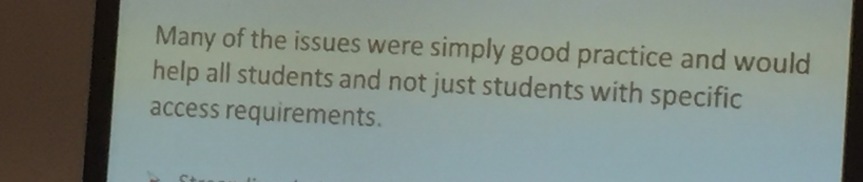
use screen margination software for a number of reasons – one of them being you need a large screen. Suggestions like plug your laptop into your TV assume you have a TV in the first place and  besides, have you ever tried it? If you could put the TV on your desk it might work but most TVs sit in the corner of the room or are fixed to a wall.  Not everyone has wireless connectivity, cables are trip hazards while sitting comfortably with a keyboard, books, coffee cup etc on the floor is not always easy.

I get by with Ctrl+ and Ctrl – although some recent websites designs prevent this. Instead of enlarging content I find myself scrolling down the screen instead. Latest versions of Windows have a slider bar controlling magnification but my Surface and laptop only have a limited choice of magnification options. Choosing the higher ones creates anomalies e.g. items you’re used to seeing on the taskbar get hidden like in the before and after images below (the upward arrow is the hidden icons tray). This might seem trivial but it isn’t. Also note how the text in the footer bar remains the same size!

Image showing the taskbar at default size

Image showing the task bar enlarged with missing icons

I don’t always want everything enlarging so I prefer Ctrl+ and Ctrl- to manage my onscreen view on a page by page, file by file basis.  The problem with programmes like Word is you can only increases the working area.

image showing enlarged text in Word while menu bars remain small

Sharepoint shows enlarging the toolbars and menu items as well is possible but you can see in the image below how the browser tabs remain resolutely tiny.

images howing enlarged text in Sharepoint also enlarges the edit toolbars while browser tabs remain small

It’s worth mentioning how exploring and utilising the Windows accessibility options involves working with menus displaying a default text size – which is too small to read – which is why I need to enlarge it in the first place!   This is a typical accessibility loop – like opening an online document to find a message on page iv saying if you need an alternative format please contact …… Um….. shouldn’t this information be provided somewhere other than within the online document itself?

I don’t want the size fixing – I want the flexibility to increase and decrease online content depending on the context, device, location, light, time of day etc. If MS SharePoint can take the step towards getting it right,  why doesn’t the Office suite give me the same accessible working environment?

Who else cares about these issues? Some answers can be found in Accessibility Matters; Part Two

Inclusive T and L conference Part Two #itandlexcellence

slide with text saying inclusion is for everyone

Many of the issues were simply good practice and would help all students and not just students with specific access requirements

Part One inclusion/exclusion issues with chairs offered first thoughts from the Inclusive Teaching and Learning Conference. Part Two contains further reflections and takeaways.

Alan Hurst opened the Inclusive Teaching and Learning Conference at York St John with a reference to Michael Oliver. Great call! Oliver’s influence with regard to the construction and promotion of the social model of disability in HE was a transformational threshold. This transferred the cause of inaccessibility from the individual to the environment where barriers to participation could be  physical and/or cultural; a huge step from a deficit model whereby the ‘problem’ was perceived to be caused by individual impairment. Adoption of the social model led to major changes to the built environment; ramps into public buildings, installation of lifts, accessible facilities and (marking the early days of the internet, when Tim Berners Lee led on digital democracy) the World Wide Web Consortium (W3C) and Web Accessibility Initiative (WAI).

diagram showing medical and social models of disability

I didn’t hear the social model mentioned again.

Other takeaways for me included a reminder of Universal Design in Higher Education: From Principles to Practice (2008) – all HEI should have a copy. Where is the UK equivalent?

Inclusive teaching needs building in (like the production of transcripts or other textual equivalents) to the learning design, not added at the end. Bolt-on methods can be better than nothing but are never seamless and prone to dropping off.

Inclusive teaching means stop making assumptions. We are all different. Individual needs may be invisible. Where they are public (assistance dog, wheelchair, amputation) associated needs might not be what you think. Start a  conversation about preferences for learning.

Prof Ann-Marie Houlton used the analogy of a kaleidoscope in her keynote. It worked well. Turn the tube. Click. Different pattern. Effective learning design is a kaleidoscope. It offers with diversity but all the pieces you need are already there.

A slide linking inclusive design to a kaleidoscope

The institution of higher education (HE) is a beast; large, old, traditional, eclectic and so on…. Changing the culture of HE presents complex challenges and no where is this more true than inclusion. I worry about society taking backwards steps rather than forward ones. Ideally, inclusion is holistic. The reality is inclusion being seen as something someone over there (not in my place) does for disabled students. Another blog post I think.

Inclusive teaching deserves a scholarly approach. Who is writing about inclusion these days?

Inclusive teaching involves understanding how language matters. Disabled students or students with disabilities? Inclusion as a disability issue or inclusion as universal design, an improved experience for all.  The focus of the workshop Fostering inclusive language and behavior in the classroom was gender and sexuality; excellent places to start rethinking the roots of exclusive attitudes and practices (presenters Liesl King and Helen Sauntson used non-inclusive rather than exclusive – is this another linguistic shift? Should I stop referring to a an inclusion/exclusion binary?)

slide showing examples of attitudes - contact me for full text

Language is the biggest building block in the world! It constructs self  and reality. Perpetuates social stereotypes. Discourse analysis and visual literacies are valuable tools but who still uses them? Science is fighting back. Rationality rules. The further we move from the postmodern turn, the more single sources of truth take centre stage. We need to challenge this. We need to talk.

As always with conferences the best conversations took place around workshop tables and over lunch.  I picked up some useful links including the Jisc InStep project looking at curriculum design and graduate attributes. From 2009, it’s judt as relevant today.

So what happens next – after the conference, still in the zone, feeling the buzz. What happens when we’ve thought about inclusion, reviewed programmes and practices, ticked the boxes – when do we stop?

The answer of course is never.  Inclusive teaching should be agile, permanently in beta, continually under development. Each year every class and cohort is different. You wouldn’t have a fixed approach to your teaching (would you?) and it’s the same with inclusion.

HE is a rite of passage but the path can be tricky. Sometimes blockages happen or barriers inadvertently reinforced. It would be good to see more inclusive T&L conferences, including opportunities to talk to students about their own experiences. Inclusive teaching is about listening.

slide showing student comments about complex decision making - contact me for full text version slide showing student comments about disclosure - contact me for full text version slide showing student comments about reasonable adjustment - contact me for full text version

Finally, inclusive teaching is about what we do. Let’s have more conferences around learning designs – so long as one of its pillars is inclusive practice. Either way, did I mention this? – we really do need to talk.


images my own except medical and social model ones from http://ddsg.org.uk/taxi/medical-model.html 

contact me for full text version of slides s.watling@hull.ac.uk


inclusion/exclusion issues with chairs #itandlexcellence Part One

image of coloured plastic chairs on wheels

Chairs on wheels meet solid floor. Blessing or nightmare?

Easy to move, don’t need lifting, don’t scrape or grate when dragged

BUT

…can be difficult to sit on, too easy to slide backwards before you’ve made contact or can fail to provide support if you reach out for them. Chairs on wheels might be good for some but not others.

The conundrum lies at the heart of inclusive practice.
One-size-fits-all models are rare.

Take bobbled surfaces known as textured paving. It warns those with visual impairment of a road crossing but bouncing over them can be uncomfortable for wheelchair users. Shared surfaces where pavements blend seamlessly into roads make crossing easier for those with wheels but can be confusing (even dangerous) – in particular for assistance dogs trained to stop at raised kerbs. The risk is  absence of an inclusive solution becomes an excuse for not changing practice in the first place.

photo of colleague Patrick Lynch at York St John

Yesterday I attended the Inclusive Teaching and Learning Conference  at York St John University with colleague Patrick Lynch.  The opening Keynote by Prof Ann-Marie Houghton set the scene; universal design means changes for some which create an improved experience for all. Accessible design is not an activity targeting disability. It’s a state of mind and a practice which can benefit everyone.

Digital exclusion was largely missing from the conference. There was reference to commuter students in rural areas not having high speed internet (true for some areas in towns and cities) but I missed references to inclusive design of documents (headings and styles please) or standard attention to font, text size, colour, contrast etc.

This isn’t because we’ve reached some magic tipping point where all resources are accessible. Any VLE offers a range of poorly designed lecture slides which don’t print well in b/w, have too many words on top of images or my pet hate of grey font on white (I can’t see it!!) or audio and video without text equivalents.

In one session we were told it wasn’t possible to provide transcripts for captured lectures because the technology isn’t there yet. This implies a gap while waiting for the technology to catch up yet Windows ‘speech to text’ is not bad and there’s a range of free apps which will give a workable document for editing. Yes, it’s a digital capabilities issue which is all the more reason for institutional support to develop digital ways of working but any lack shouldn’t be an excuse. Where lecturers create and upload notes and/or slides before their presentation, this is the basis for a textual version of recorded content.

It seems students need to disclose and have their ‘disability’ accepted in order to have a text alternative provided for recordings which in itself feels like an exclusive practice.  Audio/video alongside notes and/or images offers a holistic learning experience. Why wouldn’t we want to support students in this way? How many lecturers have tried extracting core information from a 50 minute podcast dealing with an unfamiliar topic!

The exception was Prof Houghton who gave the first keynote with clear, well spaced slides and ‘There’s alt-text on the images.’  Not a phrase you hear every day. In fact, I don’t think I’ve ever heard it. Maybe I don’t go to the right conferences. Most of them are about learning and teaching in particular where it’s online….

Inclusion is about so much more than making reasonable adjustments for some. It’s about the freedom to move independently within the built environment and getting on and off public transport, it’s about dropped kerbs and street art springing unannounced from pavements. It’s about the language we use, consciously and unconsciously. It’s about the social construction of attitude and bias.

Exclusion is created by culture and society and preventing it begins with adopting inclusive design practices.

image showing road cross with no textured paving

This pedestrian crossing over a dual carriageway appears to have no textured surface to indicate the road (taken recently in Hull) 

photo of pavement water fountains
This feature lacks barriers and the water is intermittent; if you couldn’t see it, how would you know?  (Belfast 2013)

Changing the culture of HE is complex and challenging. Nowhere is this more evident than learning and teaching where responsibility for inclusive practice is too often seen as being somewhere else, anywhere else, except with us. TEL-People say it’s within Student Services who say they’re not techies and on it goes. We need to work together on this. The aim is a tipping point where inclusive design and teaching becomes the norm. We’re going round in circles. Conversations at the conference were similar to those from two decades ago. If anything, the issues have become more convoluted.

image of the cover of TechDis Accessibility Essential series of guidance for accessible online content

The lack of a go-to resource doesn’t help. Jisc TechDis is no more. Such a loss. Their Accessibility Essentials series hit the spot while Informing Policy, Improving Practice and Improve your 3 Rs – Recruitment, Retention, Results remain excellent introductions and rationale. We need more not less of the TechDis attitude and enthusiasm for inclusive practice.

Knowledge makes so much difference. Simulation has been frowned upon for failing to authentically replicate lived experience, but a day in a wheelchair or wearing glasses which mimic glaucoma, cataracts or macular degeneration can offer transformative insight. We need to remember not everyone with an impairment is registered as disabled and take care not to confuse the issues. Hundreds of thousands of people live with invisible conditions such as colour blindness, dyslexia or some form of sensory difference. While careers and consultancies are constructed from the impact of diversity, most of us want to do what others take for granted, for example use the internet and read what’s on the screen (did I say no grey text on a white background please?!)

I’m stopping now before I get really ranty but will end on a plea – if you were to make one single change, please do think about how you present content, in particular online. Plain font, decent size and good contrast are all essential. For those of you who believe Browser customisation is the answer – it can’t work unless content has been designed to adjust.

Everyone is different. It should be what makes us special rather than a problematic.

Also, if you agree please retweet, repost and reply – let’s continue the conversation.

image showing a diversity of cartoon people
image from the presentation of Prof Ann-Marie Houghton. 

Photos all my own or from the conference presentations.


What’s your excuse?

pencil sketch of a bar of soap and a box

I’m in that cleft stick again. The one called accessibility. That’s my stick in the corner. On its own. Because most of the time we don’t think about it – don’t talk about it – and with exception of a small band of colleagues from across the sector – we don’t much care about it either 😦

I’m drafting a policy document for the use of Panopto. I can’t say the words (Shhhhh lecture capture) because that colours how people see the software. It influences usage. In the way VLE’s get used as digital depository dumps, recording 50 minute lectures is making minimal use of the affordances as well as being poor pedagogical practice. Try it yourself and see. Choose an online lecture. Unplug your speakers, turn off your sound and be sure to concentrate…

For the last decade multimedia has been challenging the supremacy of text. Yet for all the speed and variety of digital content, there isn’t a one size fits all method for getting messages across. This is the century of communication. Toffler called it the Third Wave. An information age following an agrarian and industrial/technological age.

blue information symbol

The 20th century has bought an obsession with the collection, curation and communication of information. Now in the 21st we have big data and learning analytics. It can only get better (or worse depending on your ontology). I’m unconvinced by this new data revolution. Its rhetorical promise is like the hyperbole heralding the arrival of the VLE and look where that got us.

The grating sound is the soap box being dragged out.  Early this year I presented the keynote at a Making Research Count Conference at UCL. The theme was living and working in digital times and included barriers to digital access. Feedback included this – which says it all…

Digital inclusion/exclusion was a huge topic about 5 years ago, but seems to have been forgotten somewhat now and, yes, it’s still so important.

Digital exclusion is invisible. With digital platforms of the public sphere those denied equality of access are neither seen nor heard. People agree social exclusion is a big issue (which it is) and digital divides are important (which they are) but when it comes to doing something then the whole shebang is seen as being outside of their remit. Let’s bring it closer to home.

drawing of a digital divide between ipad and paper

How are you getting on with the recorded lecture with no sound?

It’s a new academic year. The DSA has changed. Institutions have to consider the principles of reasonable adjustments. Software like Panopto is being hailed as a convenient answer but unless textual equivalents are provided how can it be?

I wave the digital inclusion flag with regard to online learning and teaching content but it’s lonely out here. Sort of invisible. It would be so much easier if we were all in this together but other people don’t seem interested. There’s always an excuse or it’s the responsibility of someone else. They talk the talk but don’t do anything about it.

Accessibility isn’t to be put aside until there is more time. The future will never have enough time. It will be exactly the same as it is today. It’s 2016. Equality has been a legal requirement since 1995. Part of the problem – I think – is how digital inclusion gets side-lined into being a disability issue rather than a fundamental digital capability leading to best practice and experiences for all.

We need to talk!

Why we should

  • It’s a legal requirement (Single Equality Act 2011)
  • The law takes a proactive approach – content in alternative formats should be provided not requested  Universities have to make reasonable adjustments
  • Inclusivity improves access for everyone (not just people with disabilities, international students, etc etc)
  • Multimedia is a valuable learning tooI
  • access is explicit in the sconul 7 pilliars of information literacy through a digital lens
  • It will enhance learning

Why we don’t

  • We don’t realise any of the reasons why we should
  • TechDis has been disbanded
  • It isn’t an explicit element of the Jisc digital capabilities framework
  • We’d know its important and would love to but…  we haven’t got the time, resource, money, skills, capacity, interest – fill in the blanks.

So what’s your excuse? What are your thoughts? Do you agree? Disagree? Lets get a conversation going and make 2016 the year for virtual inclusion.

Tweet @suewatling and #digitalinclusion

————————————————————————————–

digital divide image from http://www.idgconnect.com/IMG/082/17082/digital-divide-india1157-620×354.jpg?1412145199 
information symbol https://upload.wikimedia.org/wikipedia/commons/4/47/Simple_Information.svg